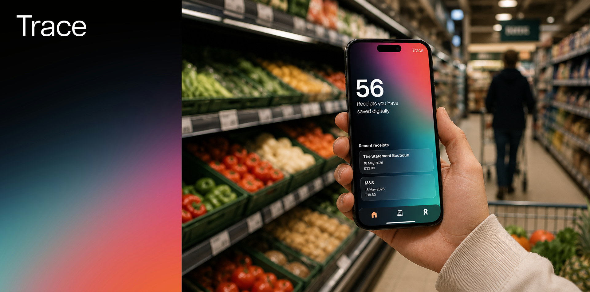
WHAT IS TRACE?Trace is an app designed to move people away from paper receipts and toward a sustainable, reward-driven digital alternative for managing everyday purchases.
The app acts as a companion for tracking purchases, returns, and exchanges by linking directly to your card. Every time you pay, the receipt is transferred digitally to the app, replacing the clutter and waste of paper. As sustainability is a key priority throughout the experience, users are rewarded for their digital habits with local community perks such as café treats, yoga classes, and gym sessions.
Role
End-to-End Product Designer
Timeframe
3 weeks
Tools
Figma
THE PROBLEMSReceipts are difficult to manage and harmful to the environment.
Managing receipts, purchases, returns and exchanges can be difficult when information is scattered, making it easy to lose track of important details.

Paper receipts are harmful to the environment.
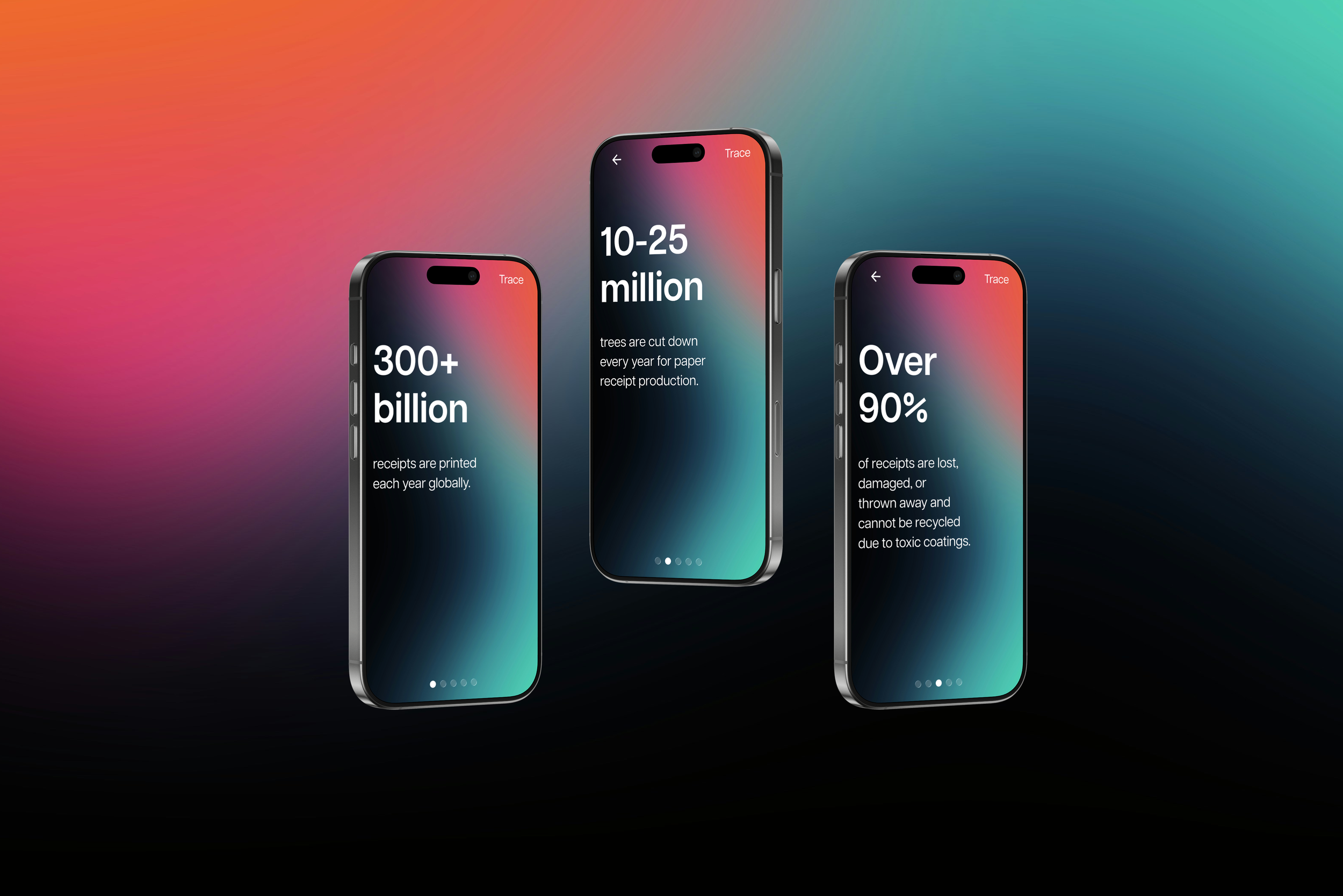
Over 300 billion paper receipts are printed globally every year, contributing 10-25 million trees being cut down annually.
Over 90% of receipts are quickly lost, damaged, or thrown away, and many cannot be recycled because of their toxic chemical coatings which can be absorbed into the skin.

THE SOLUTIONA digital receipt app that automatically collects receipts from connected payment cards, making it easy to search, filter and track purchases while rewarding sustainable habits.
Trace makes managing purchases more efficient and sustainable by automatically collecting digital receipts when users pay with a connected card. Users can easily search and filter their receipts, while managing returns and exchanges and tracking their status in one place. To encourage sustainable habits, Trace also rewards users with local community perks, such as café items, yoga classes and gym sessions.
IMPACT 1Reduced reliance on paper receipts and convert users to using digital receipts
by making the process automated, simple and organised.
IMPACT 2Improved confidence in managing receipts, purchases, returns and exchanges
through an intuitive, jargon-free experience with easy search, filtering and tracking of receipts.
IMPACT 3Made sustainable choices feel more effortless and integrated into everyday purchasing habits
by educating users on their environmental impact and rewarding their sustainable habits.

Sophie Walker
“I want sustainable choices to feel effortless for my business”
Age: 31
Education: Business Graduate
Hometown: London, UK
Occupation: Cafe Owner
-
Sophie runs an independent coffee shop and prints out receipts for every order she gets as this process is automated.
-
Reduce receipt paper costs
Improve customer experience
Make her business more sustainable
Modernised checkout interactions
-
Expensive paper roll replacements
Waste from unused receipts
Complicated POS systems

Alex Henderson
“I want to make sustainable choices without having to think about them, while keeping my purchases and receipts organised in one place.”
Age: 27
Education: Economics Graduate
Hometown: Dublin, Ireland
Occupation: Finance Analyst
-
Alex goes to his local independent café before he heads to work and orders a coffee and croissant. He pays for his order using Apple Pay and gets asked if he would like a receipt. He accepts but the receipt is later lost or thrown away.
-
Reduce unnecessary waste
Easily accessible receipts
Keep purchases organised
Track expenses effortlessly
Use thoughtful, well-designed digital tools
-
Losing receipts
Clutter from paper receipts
Overcomplicated finance apps
THE USERSUsers want less clutter and no financial jargon when managing receipts and for sustainability to be integrated, not an extra choice.
To begin the process, I created personas to understand how users manage receipts, as well as the barriers to adopting sustainable habits. Users want a simple, clutter-free way to manage their receipts without overwhelming financial jargon, while sustainability should be built naturally into the experience rather than requiring extra effort.
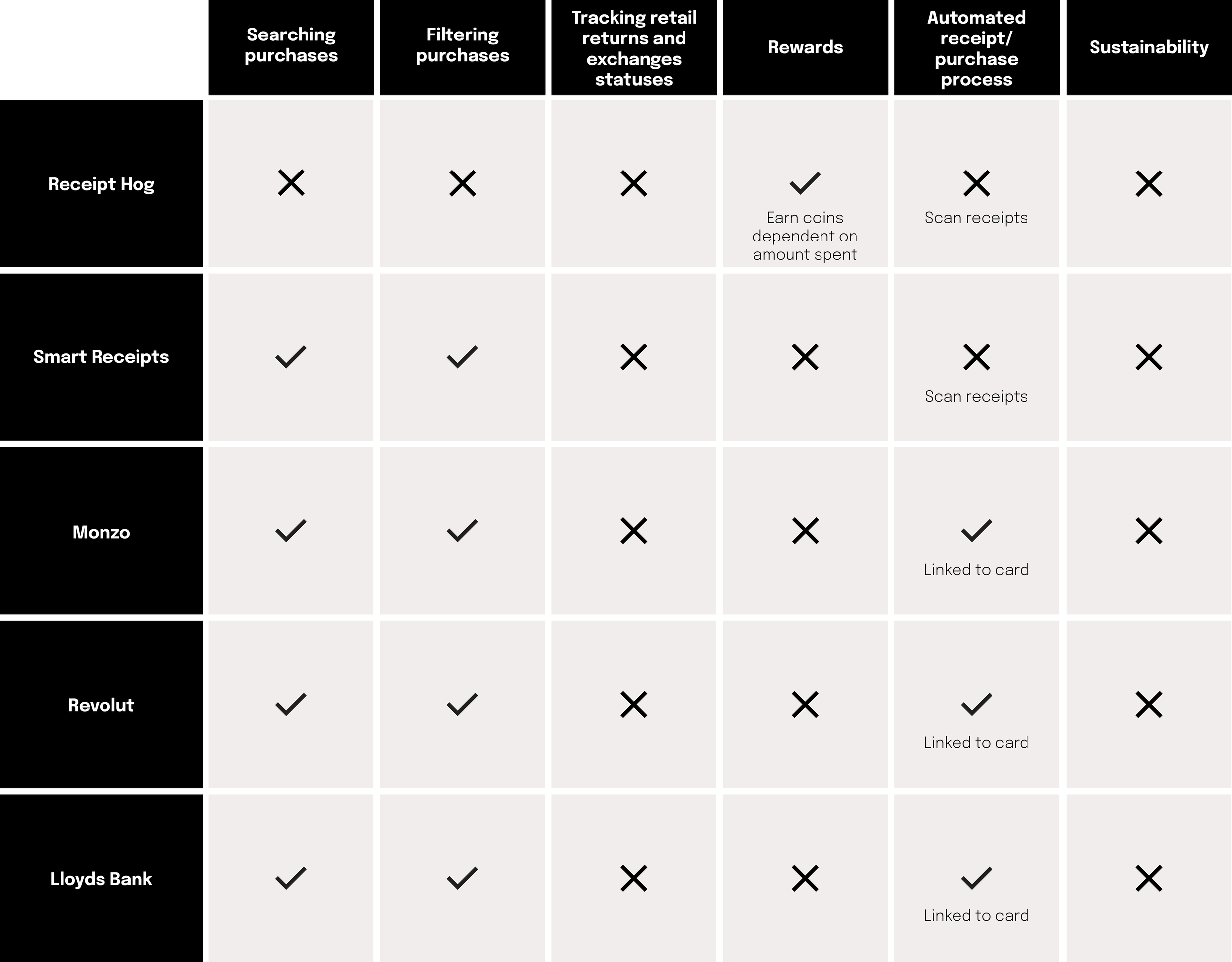
COMPETITIVE AUDIT
Competitive analysis identified market gaps across receipt management, rewards and sustainability. Existing receipt apps rely on manual uploads, while banking apps demonstrate the potential for automatic payment tracking. Reward systems primarily encourage spending and none of the competitors offered return or exchange tracking and did not have any aspects of sustainability.
PRIMARY TAKEAWAY
Opportunity exists to make sustainability the primary incentive for switching from paper to digital receipts, while combining automated receipt collection, return and exchange tracking, and rewards into one integrated experience.
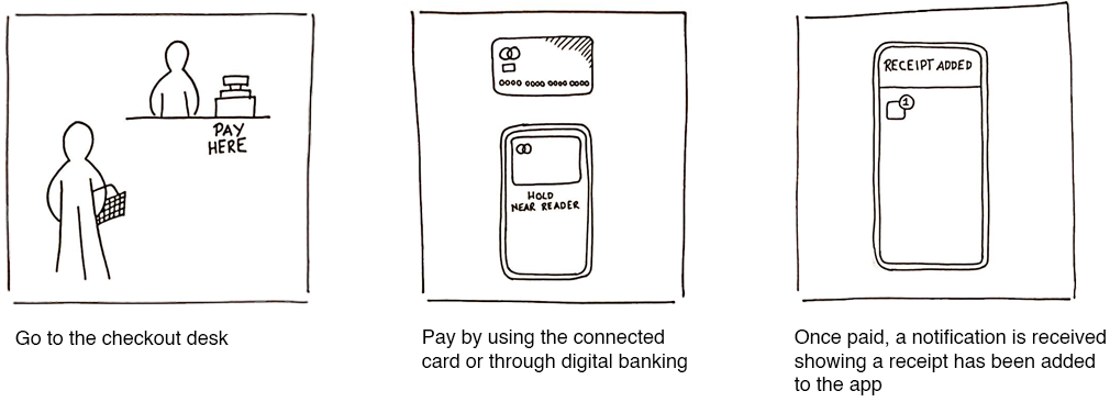
STORYBOARDVisualising how a physical purchase transitions into a digital experience and introducing tree planting as a replacement for collecting tokens to encourage sustainable habits
The storyboard was created to explore how sustainability could be integrated naturally. The competitive analysis showed that reward systems integrate collecting tokens to encourage engagement, so this mechanic was replaced with tree planting to connect users' actions directly to positive environmental impact and supporting the app's sustainability goals.
SETBACKSetback was identified in the competitive analysis and storyboard that the reward system can encourage unintentional spending
This led me to reconsider how rewards could encourage sustainable behaviour without incentivising unnecessary purchases.
B.F SKINNER'S FIXED-INTERVAL REINFORCEMENT RESEARCHResearch on B.F. Skinner’s fixed-interval approach led to shifting from volume of purchases to consistency over a set period with the aim to reduce consumerism and addiction
A fixed-interval approach is where rewards become available after a set period when the desired behaviour has occurred. This rewards users for consistently choosing digital receipts rather than collecting a set number.

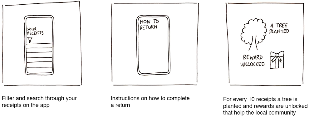
MIXED METHOD - A/B TESTING AND INTERVIEWSTesting time-based rewards vs. daily receipt limits
To test the fixed-interval research was appropriate for the product, I conducted A/B testing on two reward structures:
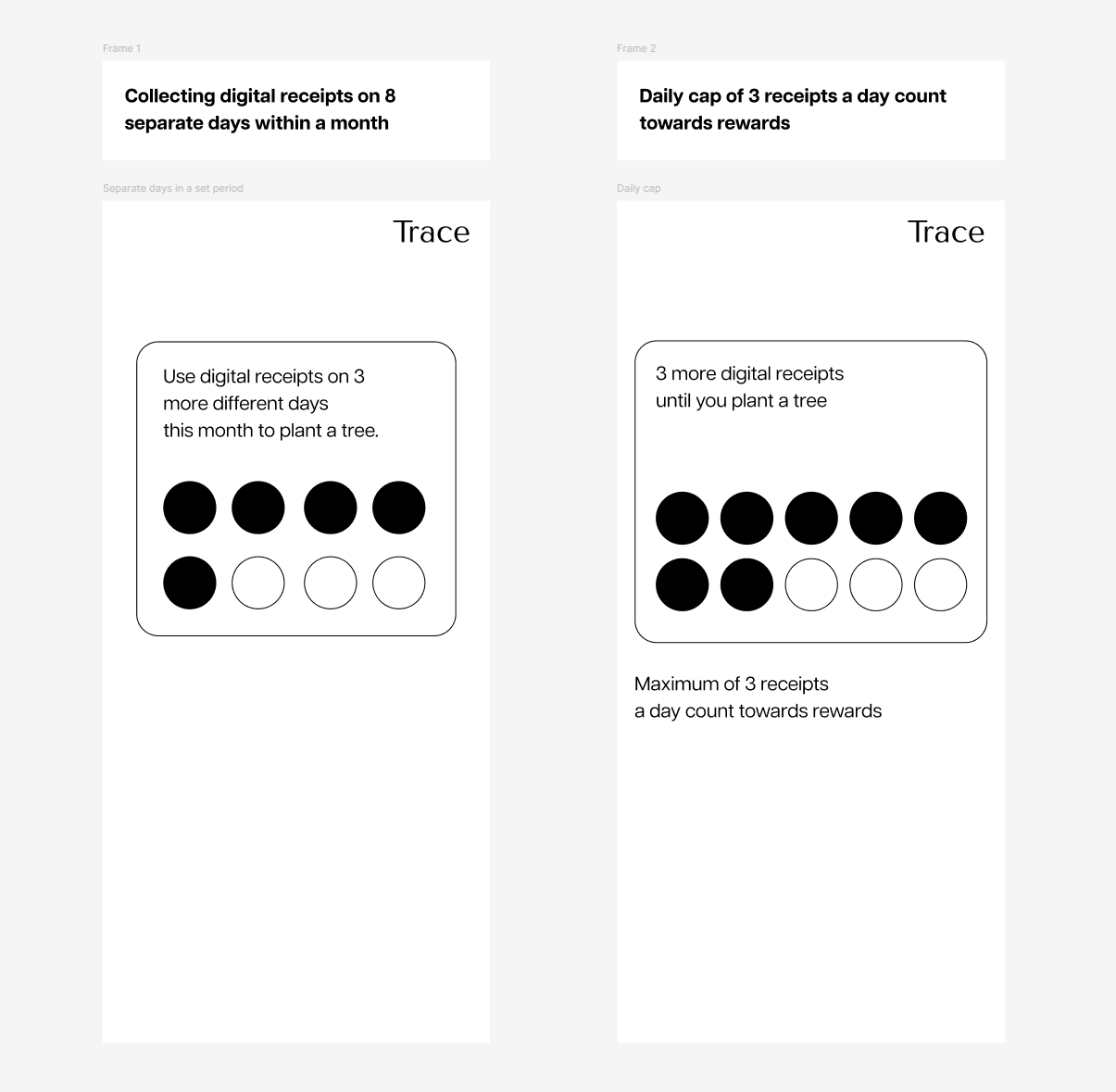
Collecting digital receipts on 8 separate days within a month
A daily cap of 3 receipts a day count towards rewards
PRIMARY TAKEAWAY
User feedback revealed that both approaches could encourage impulsive spending, as time limits and targets created pressure to reach the reward before it expired.
USER INTERVIEWS
Following A/B testing feedback, I interviewed users to understand their spending habits and how Trace could fit naturally into their routines without creating pressure. Participants found tree planting more meaningful than traditional rewards, motivating them to continue making sustainable choices.
PRIMARY TAKEAWAY
25 receipts was identified as a realistic reward threshold, aligning with users’ natural spending habits. Reaching this threshold plants a tree, rewarding sustainable behaviour and reducing the likelihood of impulsive purchases.


ITERATION + LOW-FIDELITY PROTOTYPE
Encouraging sustainable behaviour through visible impact metrics and simplifying receipt management with easy access to recent receipts
Discovery insights led to prioritising displaying number of digital receipts saved and trees planted, while global impact was added to test whether community progress could encourage sustainable habits. To avoid overwhelming users with too much information, key impact statistics rotate through a looping animation on the homepage. This keeps the interface clean while drawing attention to the user’s environmental contribution through subtle movement.
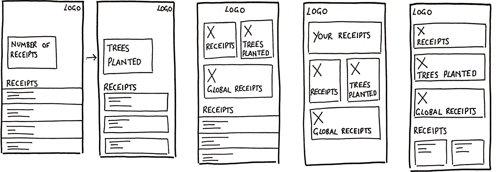
Simplifying receipt management and tracking through a monthly calendar, search and filter tools, and clear return and exchange instructions
The competitive audit highlighted the importance of combining search and filtering features to support efficient receipt and purchase management. Together, they allow users to quickly locate specific receipts and organise their purchases with ease.
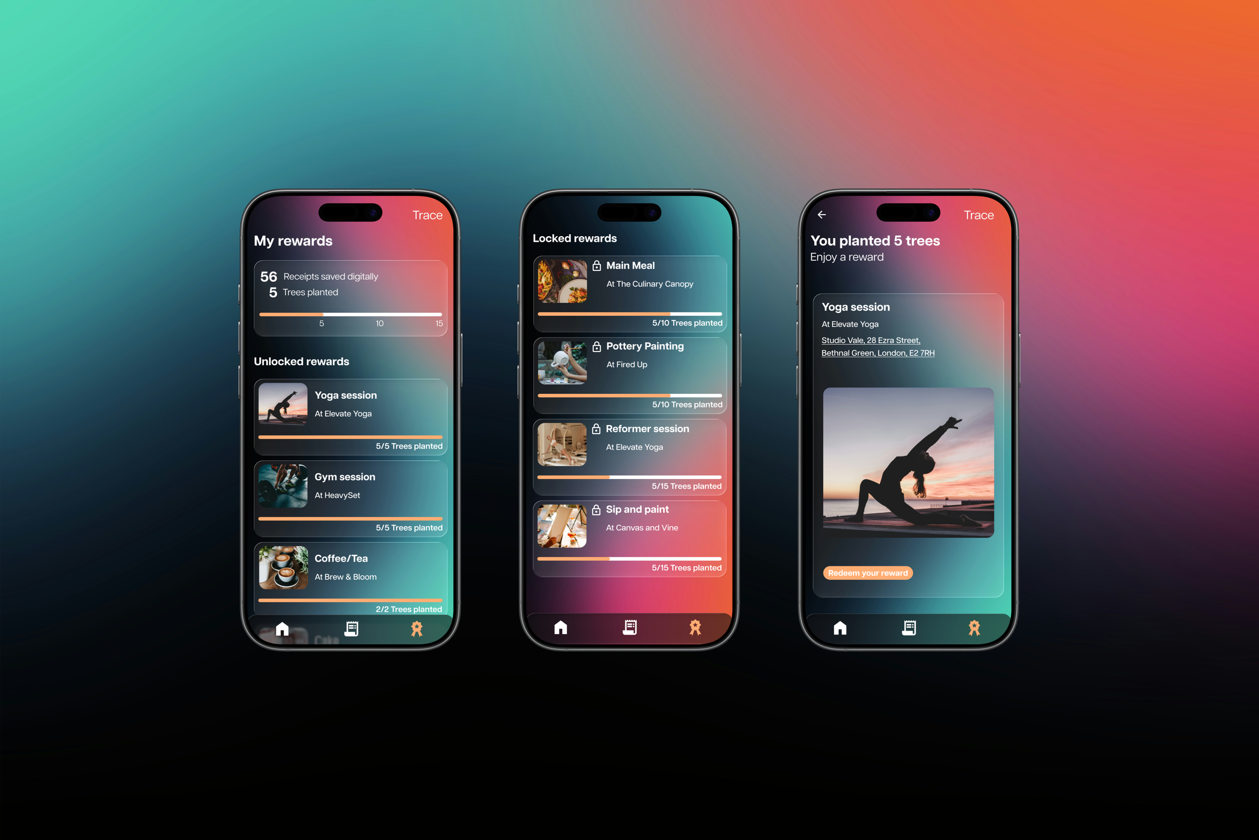
Displaying unlocked and locked rewards to encourage users to discover and redeem new rewards
Through presenting future incentives it provides visibility of potential rewards, this allows the opportunity to test whether this motivates users to continue sustainable behaviour.
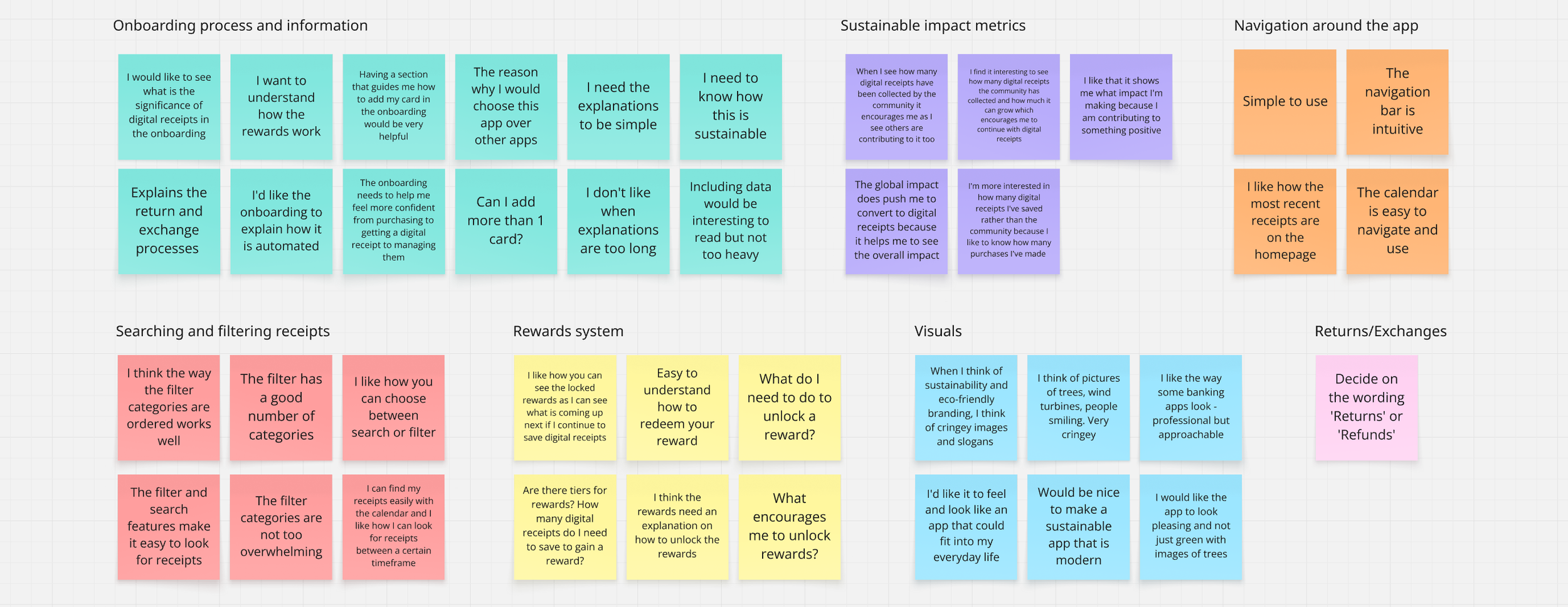
FIRST USABILITY TESTAn opportunity to research the onboarding process and evaluate whether the app could motivate sustainable behaviour
I used the first usability test as a way to research what users need for the onboarding process. Users wanted a short, simple introduction explaining how Trace supports sustainability, why they should use it and how it works.
Environmental impact statistics helped users understand the positive difference they were making, while they felt the global statistic connected their actions to a larger collective impact. Users also wanted clearer information about how rewards are earned and redeemed.
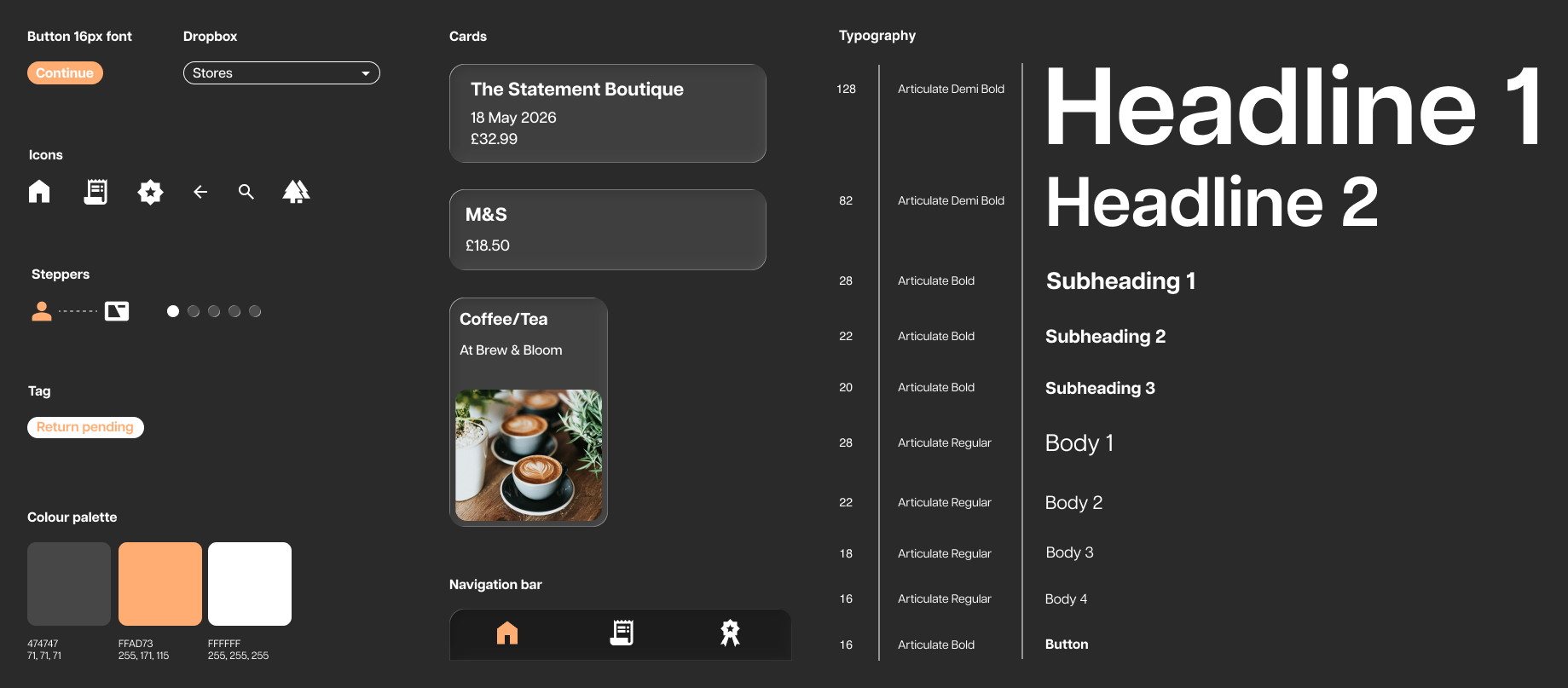
DESIGN SYSTEM + VISUAL BRANDINGDesigning a modern visual language for sustainability by moving away from clichéd environmental branding
Usability testing revealed that users often associate sustainability with clichéd imagery and branding. They wanted Trace to feel modern, professional and approachable, fitting naturally into their everyday lives.
Glass-inspired cards and soft transparency effects were introduced to create a modern, refined feel. Rounded corners, subtle borders and consistent spacing were used throughout the design system to maintain a cohesive and approachable experience.
Large typography and minimal layouts were used to make key information easy to read and scan. Environmental statistics, recent receipts and rewards were given clear visual hierarchy. Imagery in the rewards section created a stronger emotional connection by showcasing real community experiences and local businesses.
HIGH-FIDELITY PROTOTYPE
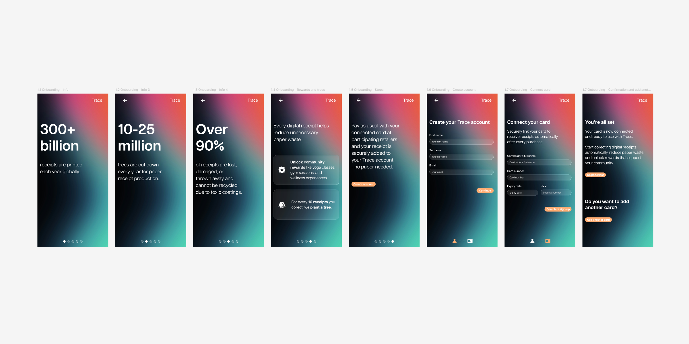
Onboarding
Impactful sustainability data educates and provides clear evidence of why users should choose digital receipts and the purpose of Trace.
Reward information encourages users to begin developing sustainable habits.
A clear explanation of the physical-to-digital process helps users understand how Trace works with their purchases to reduce confusion and increase confidence.
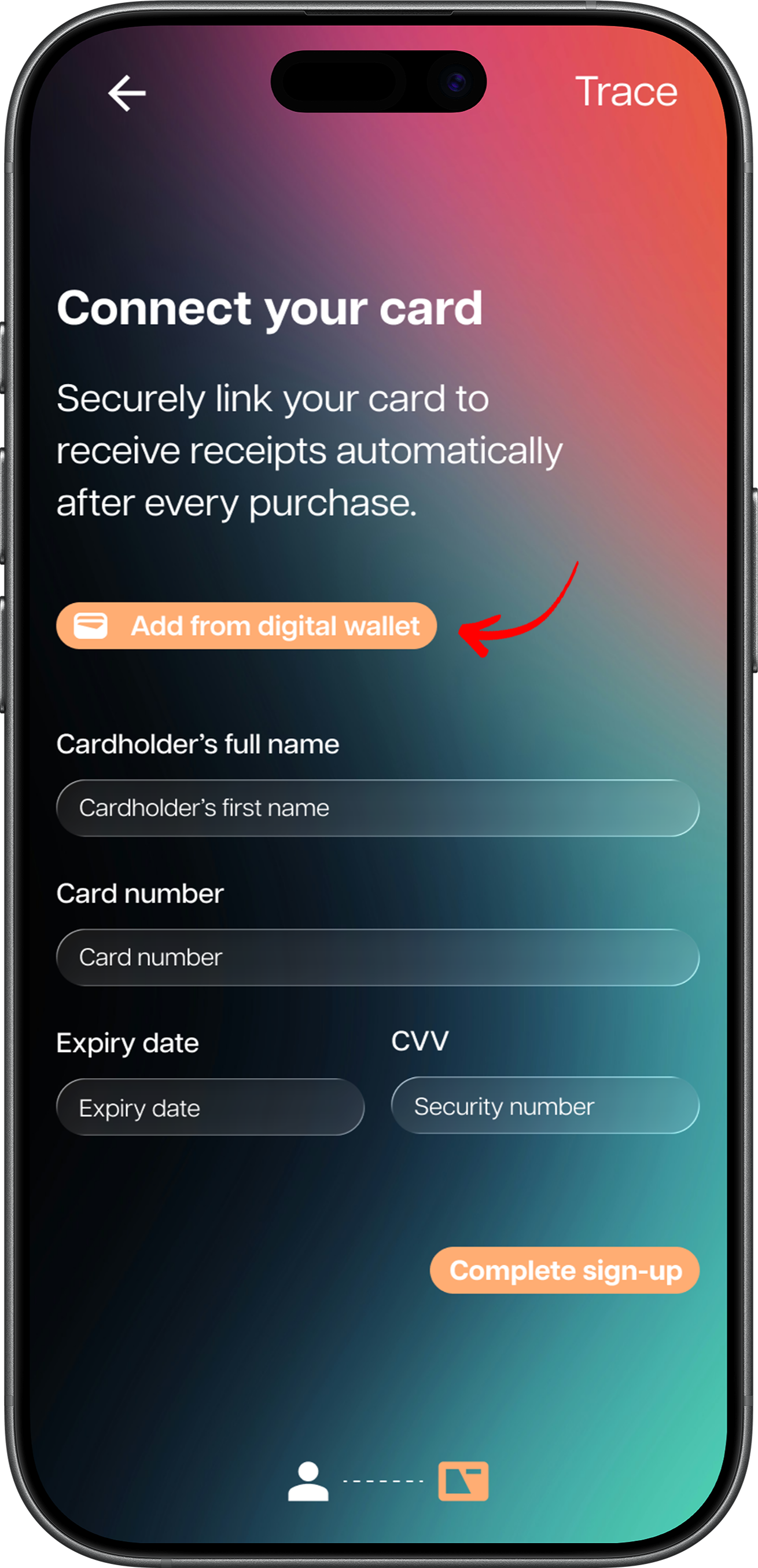
Minimal sign-up steps make creating an account and connecting a payment card quick and reduce drop-off rates.
Homepage and receipt
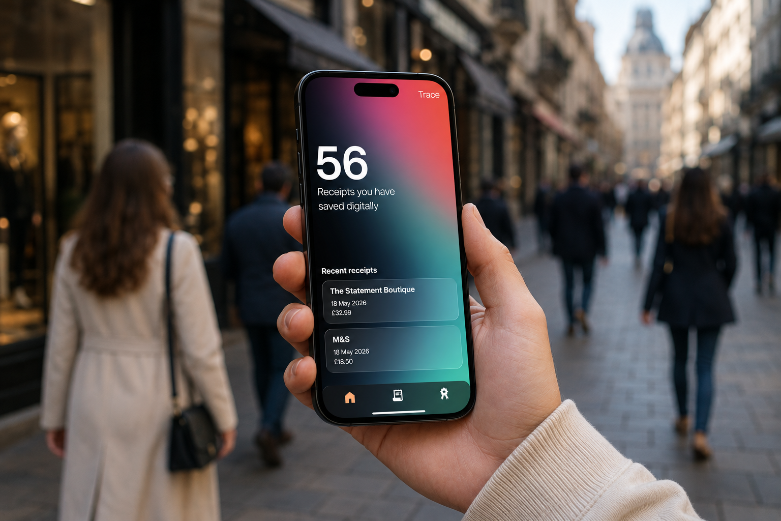
Personal and global environmental impact statistics motivate users to maintain sustainable habits.
Recent receipts are easily accessible, simplifying receipt management.
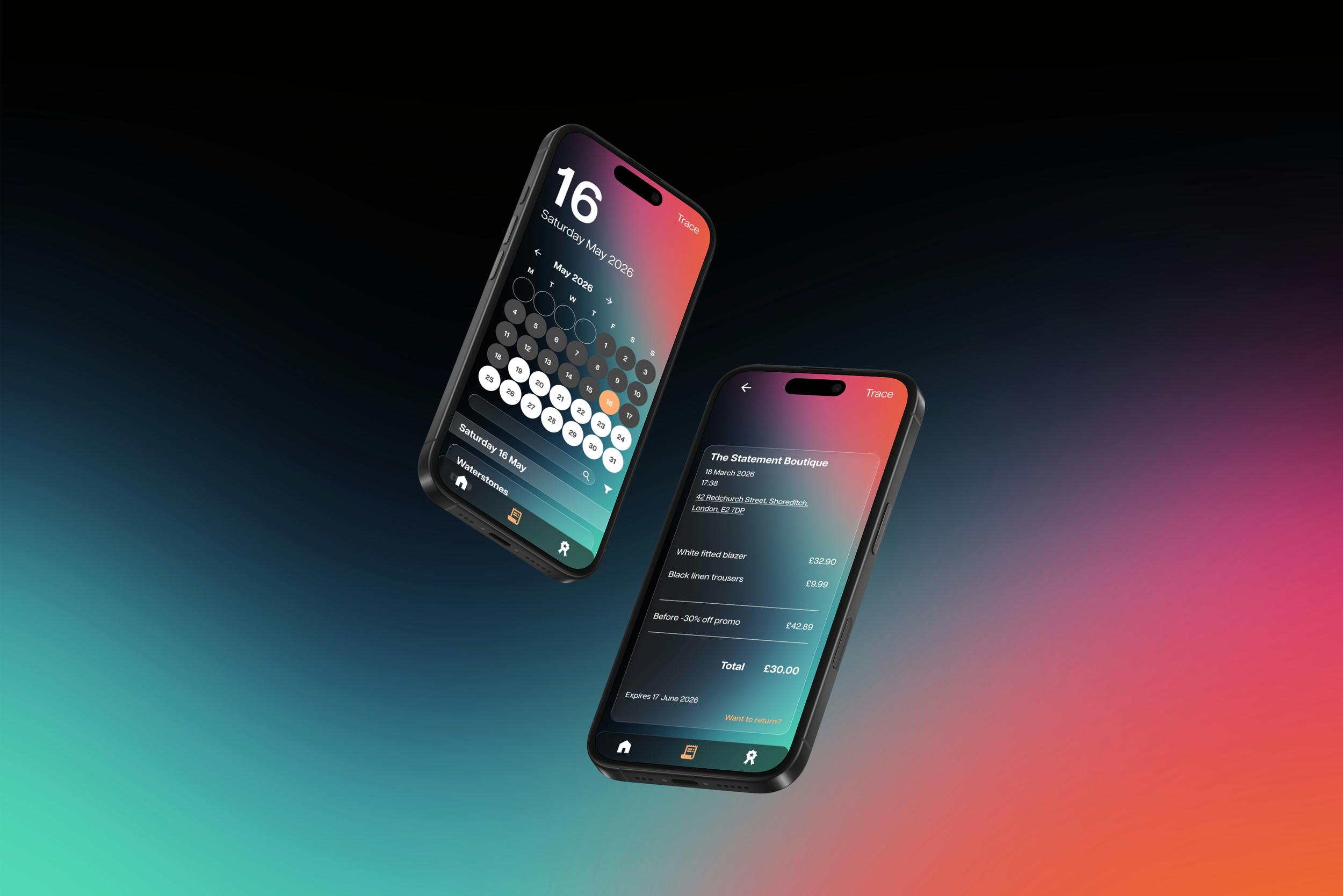
Key receipt information is clearly organised for easy reference.
Return and exchange guidance is accessible through a pop-up without disrupting the overall experience.
Receipt search and filtering
Monthly calendar view provides a clear overview of purchases and receipt activity.
Search and filtering tools make it easier to find and manage receipts.
Four filter categories keep the experience organised without overwhelming users.
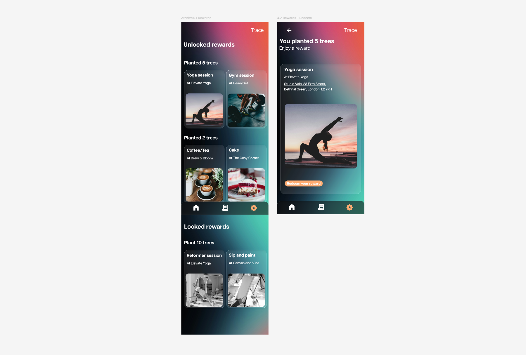
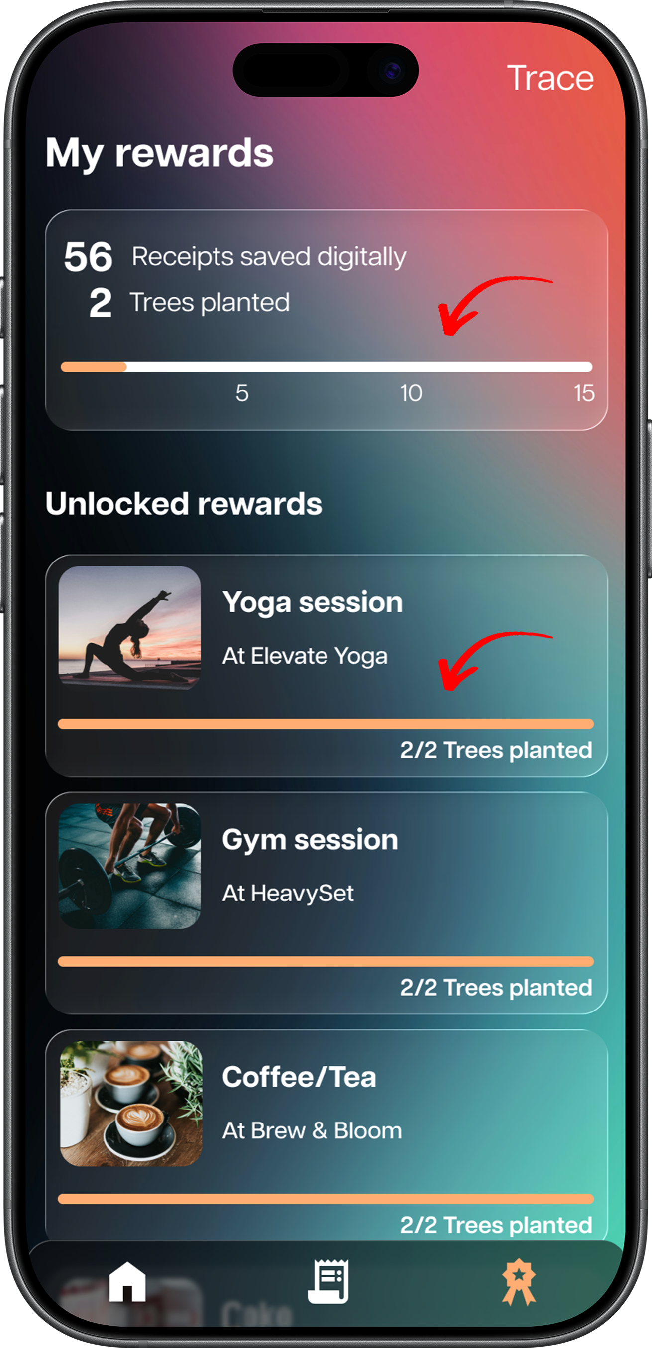
Rewards
Unlocked rewards show the benefits earned and the number of trees planted to achieve them.
Upcoming rewards provide visibility of future incentives and what users can work towards next.


SECOND USABILITY TESTTesting highlighted sustainability was integrated naturally into the process but there are opportunities to refine onboarding, rewards, navigation and filtering
A second usability test was conducted to gather feedback on the high-fidelity prototype, which now incorporated the onboarding process, design system and visual branding.
Progressive disclosure of filter categories
Problem
Displaying all filter categories at once created unnecessary visual clutter and could overwhelm users.
Solution
Progressive disclosure was used to initially hide the filter categories, revealing them only when the user selected the filter option. This reduced visual clutter and cognitive load while keeping the options accessible.

Icon Refinement
Problem
The rewards icon was sometimes mistaken for a settings icon, creating confusion within the navigation.
Solution
The icon was redesigned as a rosette to create a clearer visual distinction and make the rewards section easier to identify.
Before

After
MAIN REFINEMENTS BASED ON THE SECOND USABILITY TESTConnecting cards from your digital wallet
Problem
Manually entering card details was time-consuming, tedious and created unnecessary friction during onboarding.
Solution
Allow users to add cards directly from their digital wallet, simplifying the connection process.
Rewards progress bar
Problem
Users lacked visibility of their progress towards the next reward, making the benefits of maintaining sustainable habits less tangible.
Solution
A progress bar was added to show users how close they were to their next reward, making their sustainable progress more visible and encouraging continued habits.
OUTCOME + IMPACTConverted users to digital receipts, increased confidence in receipt management and made sustainable choices feel more natural and effortless
Trace made the transition from paper to digital receipts more seamless by integrating receipt collection into existing purchasing behaviour. By making receipts easier to access, search and manage, the experience increased users’ confidence in handling purchases, returns and exchanges. Sustainability was integrated into the process through visible environmental impact and meaningful rewards, helping sustainable choices feel like a natural part of everyday routines rather than an additional task.
KEY TAKEAWAYSDesigning for complex human behaviour and ethical projects
Human behaviour is complex, particularly when designing for habit formation and motivation. Users’ thoughts, feelings and behaviours can take the design process in unexpected directions, making it important to explore these areas in depth to understand and uncover what people genuinely need and want.
This project also revealed how rewarding it can be to design a product that is both ethical and purposeful. It was valuable to create an experience that not only solves a practical problem for users, but also contributes positively to the environment and local communities.
NEXT OPPORTUNITIESDeepening habit research, long-term testing and designing Trace for business-owners
With more time, I would deepen habit research to better understand what motivates sustained behaviour change, conduct longer-term testing to evaluate continued use of digital receipts and potential drop-off rates over a longer period of time, and explore Trace from a business-owner perspective to identify opportunities for greater local business integration.