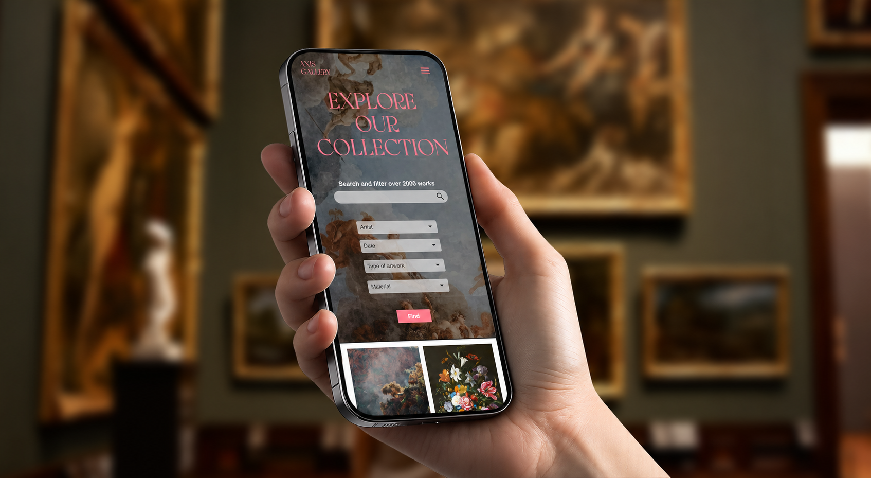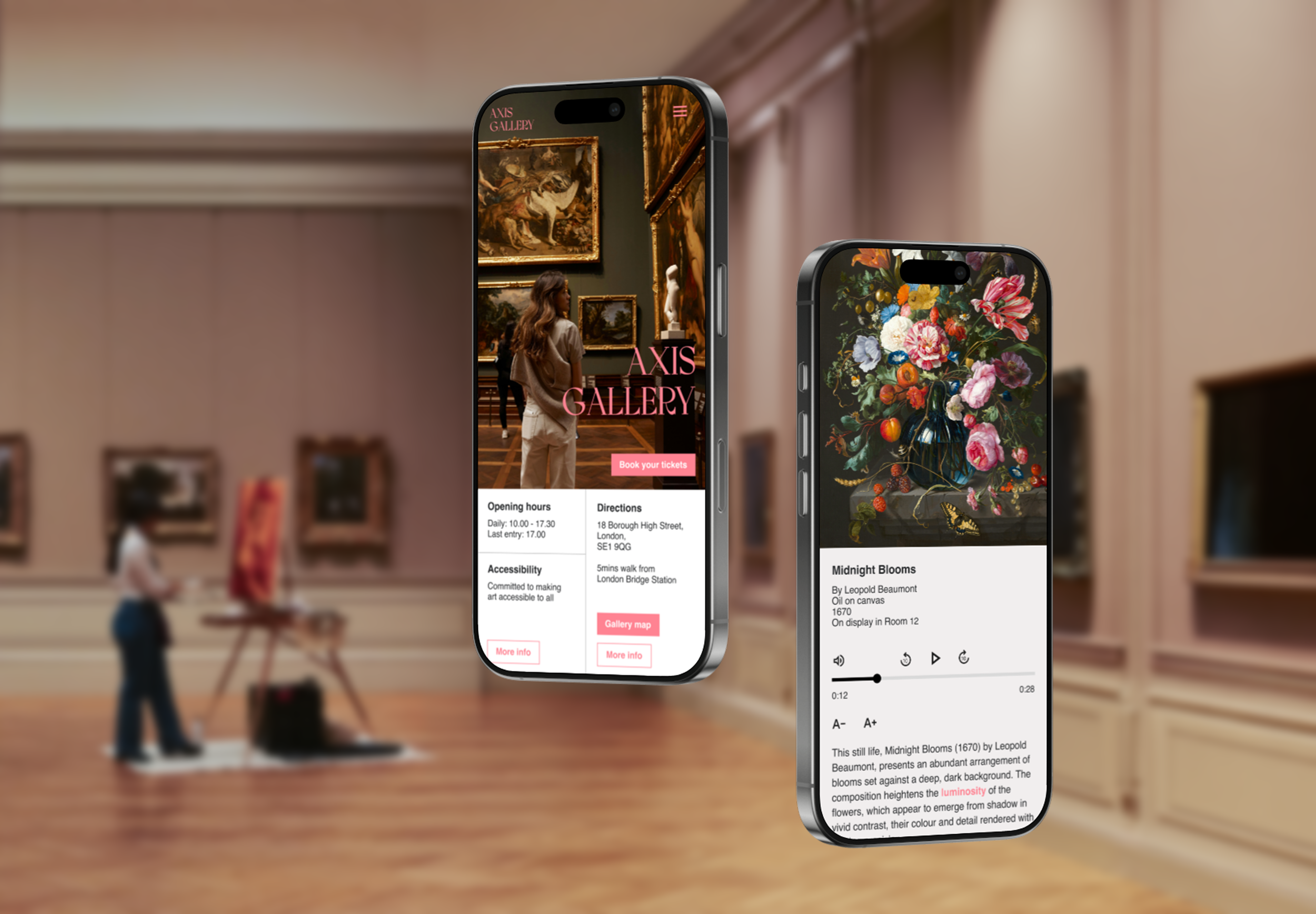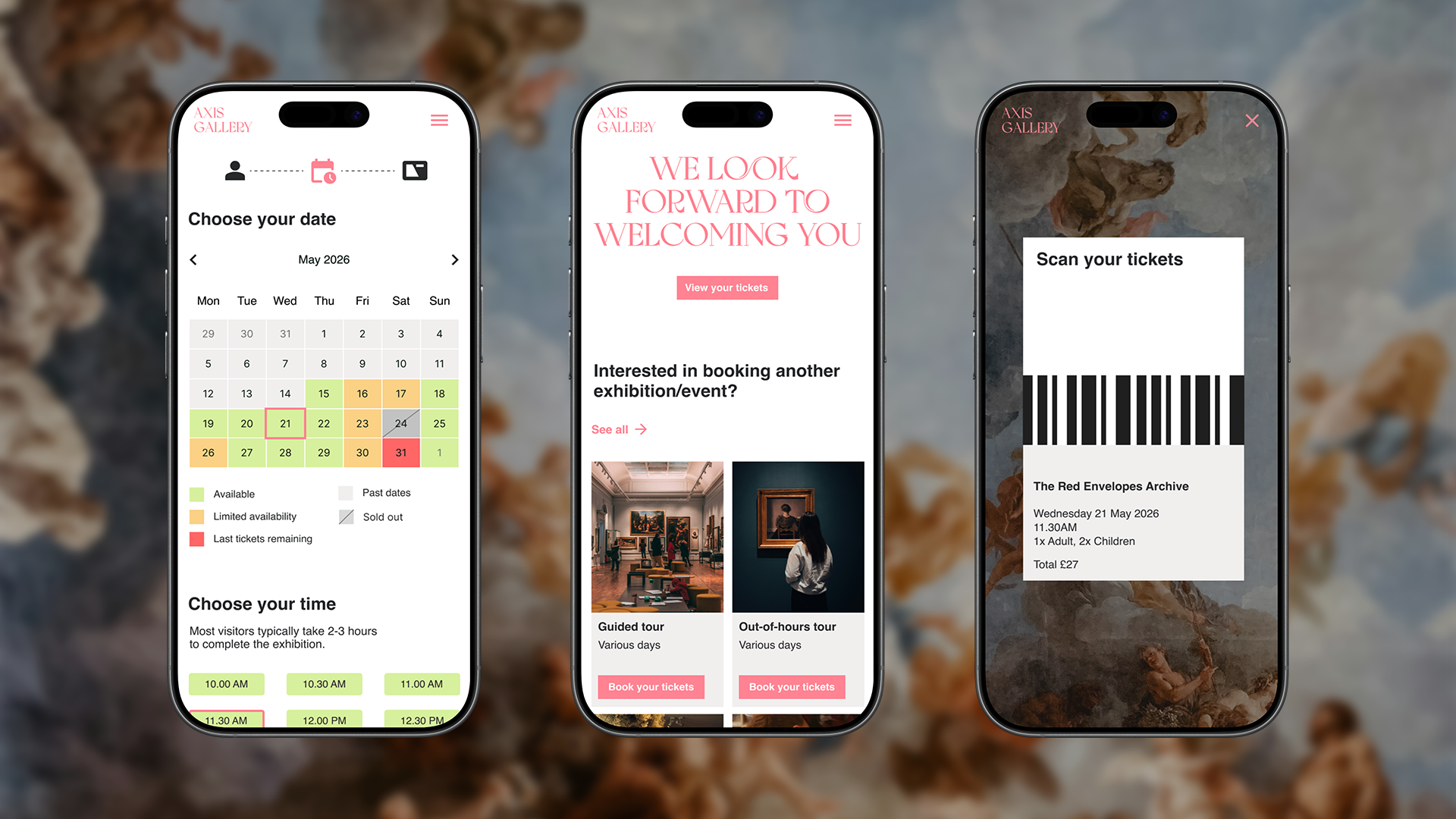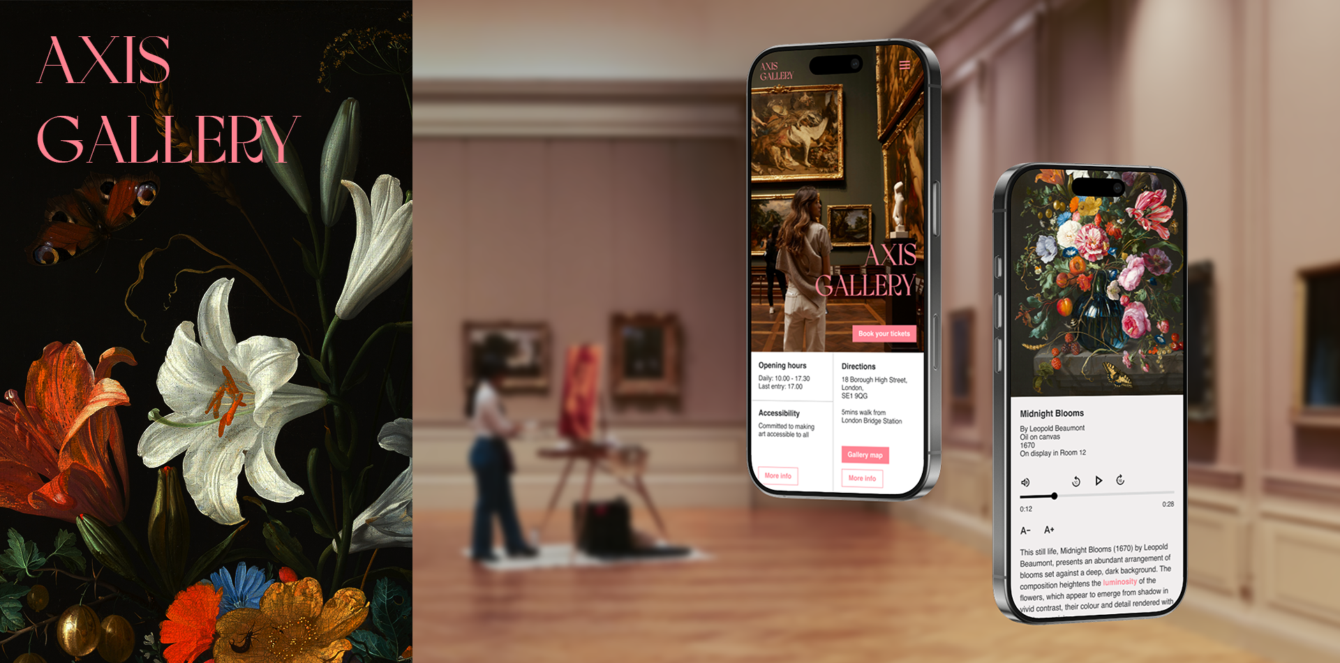
WHAT IS AXIS GALLERY?Axis Gallery is an app designed to make gallery visits more accessible and seamless through one integrated experience
The app acts as a companion with the aim to help the users across their visit through personalised live navigation, assistive technology, simplified ticket purchasing, and immersive ways for visitors to discover and learn about artworks. As the gallery is visited by a range of diverse populations, accessibility is a key priority throughout the experience.
Role
End-to-End Product Designer
Timeframe
3 weeks
Tools
Figma
TL;DROverview
Designed an all-in-one gallery app addressing fragmented planning, navigation, and artwork discovery.
Research
Ran a competitive audit against 5 major UK galleries, interviewed 6 users, and story-mapped the visit - surfacing friction in gathering information and repeated "checking loops."
Setback
Usability testing showed my artwork discovery scanning flow disrupted immersion. I A/B tested a location-triggered alternative - cutting access time from 14 seconds to instant.
Outcome
Reduced friction across the visitor journey and improved accessibility for a wider range of visitors.
Visiting galleries can often feel fragmented
THE PROBLEMSInformation about exhibitions, tickets, directions, accessibility, and artwork details is usually spread across different platforms

For new visitors especially, planning a visit and navigating the gallery space can feel overwhelming or unclear

Exploring collections and learning about artworks can feel inaccessible and harder than it should be because information is often not designed for different ways of learning

An all-in-one intuitive gallery experience with personalised navigation and more accessible artwork learning
To offer a richer user experience, the app provides an immersive gallery experience, allowing visitors to plan, navigate, and explore artworks in one place. Users can confidently prepare for their visit without switching between multiple apps, and navigate the space through personalised live routes tailored to their needs.
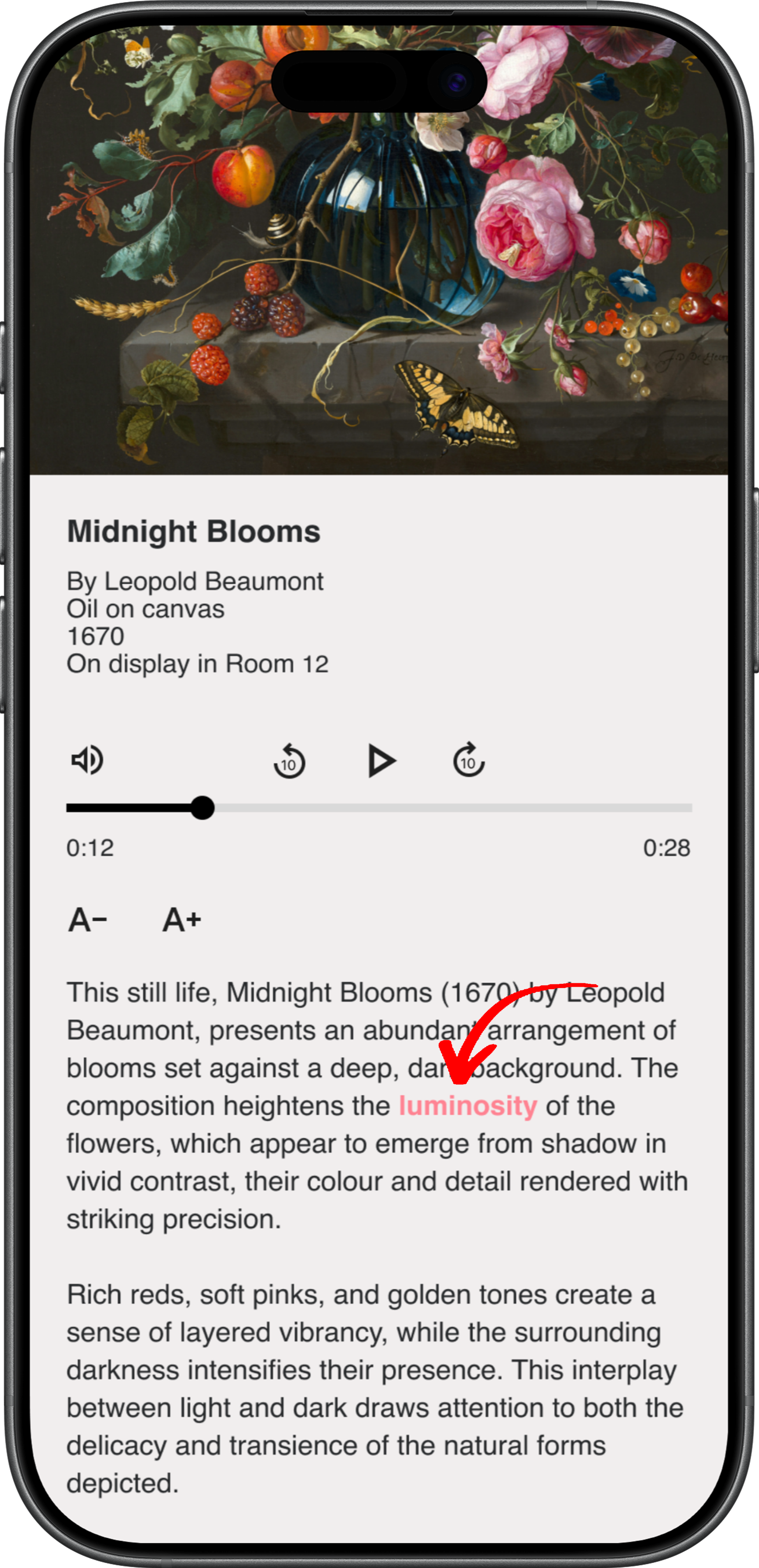
To improve accessibility and engagement, the experience includes location-triggered information that appears as users enter rooms or approach artworks. This content is available in multiple formats, including audio guides and on-screen text, with additional accessibility features adjustable text size and synchronised text highlighting.
THE SOLUTIONIMPACT 1Reduced friction across the visitor journey
by combining discovery, ticketing, navigation, and learning into a single app.
IMPACT 2Increased confidence in navigating unfamiliar spaces
by providing live navigation and clear wayfinding throughout the gallery.
IMPACT 3Improved accessibility for a wider range of visitors
through assistive features.
Visitors require different levels of guidance and support
I began by developing personas to understand the diverse needs of gallery visitors, from first-time visitors seeking guidance to those with accessibility requirements. Empathising with the user helped prioritise features that supported practical needs like navigation and visit planning, alongside experiential needs such as discovery and engagement with collections.
THE USERS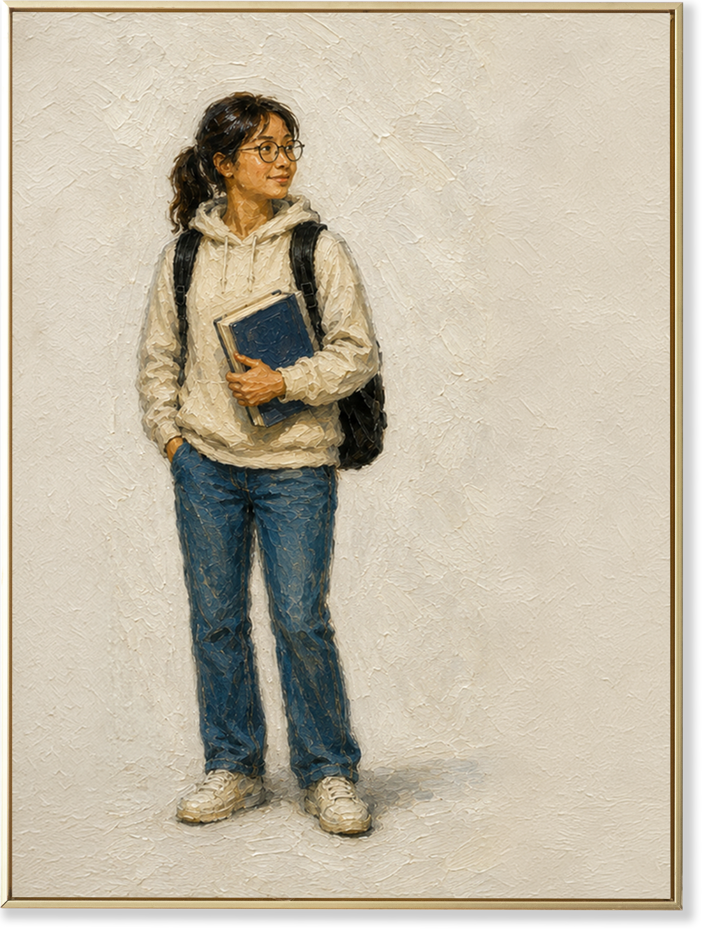
Rosie Lee
“I want easy access to inspiration, research and information”
Age: 21
Education: Undergraduate in Art History
Hometown: Hong Kong
Occupation: Student
-
Rosie frequently visits the gallery for research as part of her degree. Most times she has a limited 2 hour gap between classes. She currently spends 15-20 minutes figuring out what is on, if the exhibition is suitable for students, and booking the tickets before heading over to the gallery.
-
Find inspiration and research for her degree
Exhibitions that are student friendly in terms of time and finance
-
Exhibitions that do not cater for students financially and are closed after class or student information is difficult to find on the app/website
Lack of informationiption text goes here

"I want to focus on making memories with my children, not worrying about whether the gallery will work for all of us."
Sarah Jenkins
Age: 37
Education: Chemistry Graduate
Hometown: London, UK
Occupation: Operations Manager
-
Sarah plans to go on a day out with her children. She looks at exhibitions/events for children and accessibility routes, resources and facilities in advance for her child in a wheelchair.
-
Spend quality time with her children
Ensure a smooth and easy visit especially for her child in a wheelchair
Plan her visit in advance
-
Unable to easily find and book exhibitions and events suitable for children
Unable to plan the visit in advance
Limited information about accessibility
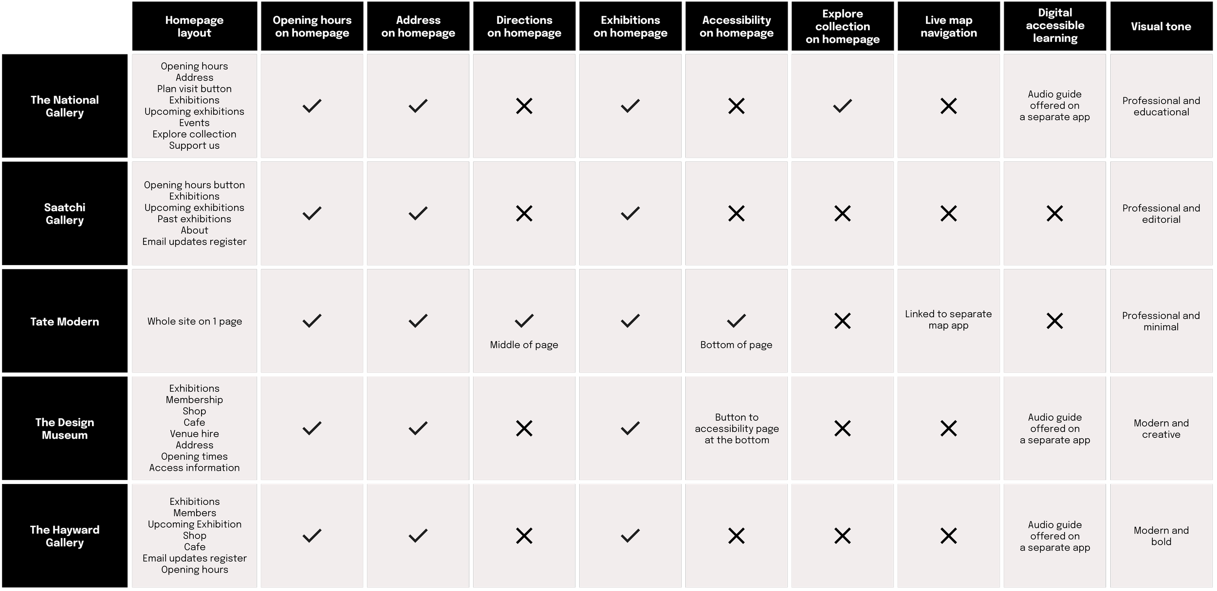
A competitive analysis was conducted to explore how other organisations integrated apps into physical gallery experiences, surfaced visit planning information, and supported accessible artwork learning. Direct competitors’ platforms, including The National Portrait Gallery, Saatchi Gallery, Tate Modern, The Design Museum and The Hayward Gallery lacked personalised navigation and visitor support. Digital accessible learning was either not available or was hosted on a separate app.
COMPETITVE AUDIT + ANALYSISPRIMARY TAKEAWAY
Opportunity to create a more integrated, accessibility-first visitor experience with real-time navigation, personalised wayfinding, and accessible artwork insights.
Hypothesis validated as users confirmed the need for an all-in-one gallery experience with personalised navigation and more accessible learning
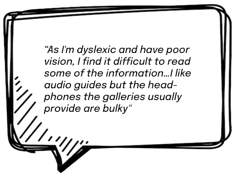
I conducted user interviews with 6 participants who ranged from casual and frequent gallery visitors, students, tourists and people with accessibility needs, reflecting the target audience for the product. The research supported the hypothesis that the proposed solution would enable visitors to explore galleries more confidently, independently, and accessibly.
USER INTERVIEWS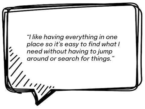
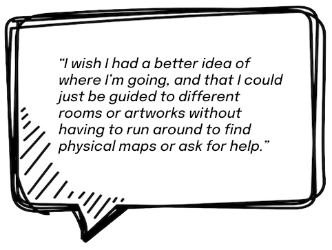
Visitors spend much of their time gathering and validating information rather than performing actions
Using insights from the competitive audit and user interviews, I created a gallery journey story map to identify points of friction and understand users' information needs throughout their visit. The map revealed multiple "checking loops", where users repeatedly returned to the same information, highlighting opportunities to surface key information proactively and reduce unnecessary effort.
STORY MAPPING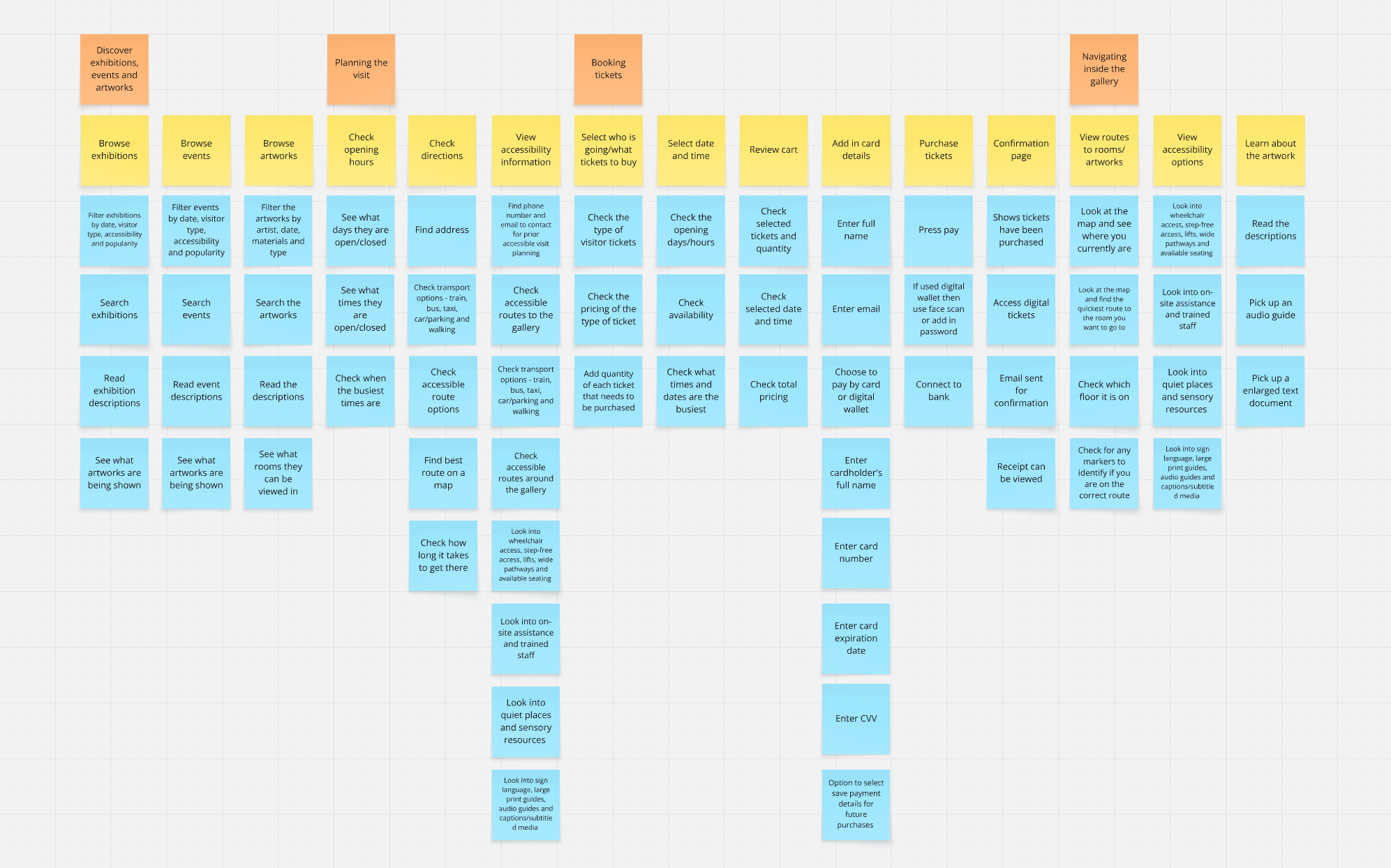
Designing to reduce checking loops, friction and time by making key information immediately accessible
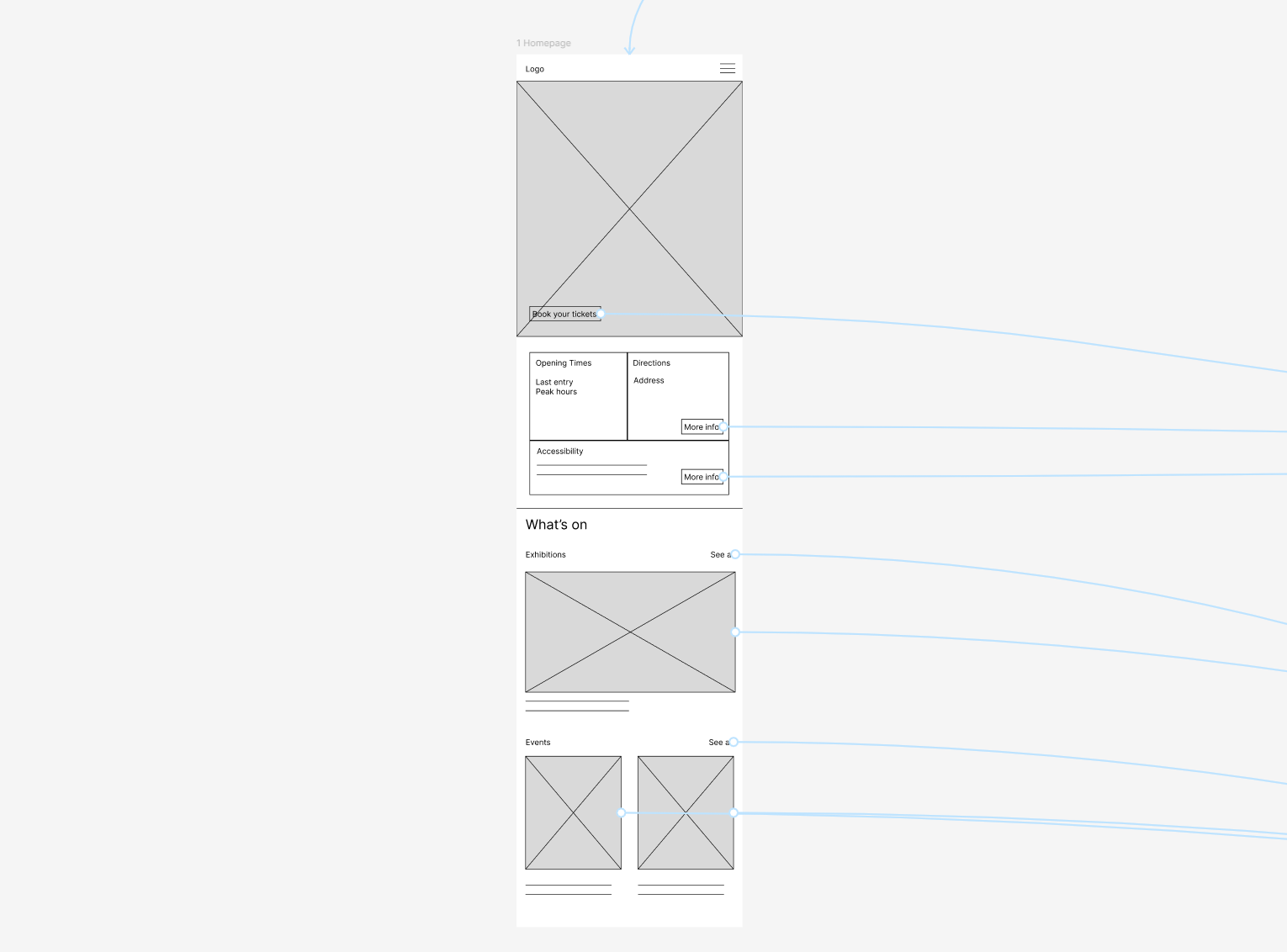
Backed by insights from user interviews and the story map, I iterated on the home screen design to prioritise information users need most when planning a visit. The goal was to reduce the time and effort required to plan by minimising repetitive checking behaviours and removing friction from the experience. Key information such as ticket booking, opening times, last entry, address details, and accessibility information was made immediately visible upon opening the app, followed by exhibitions and events for further exploration.
IDEATION + LOW FIDELITY PROTOTYPE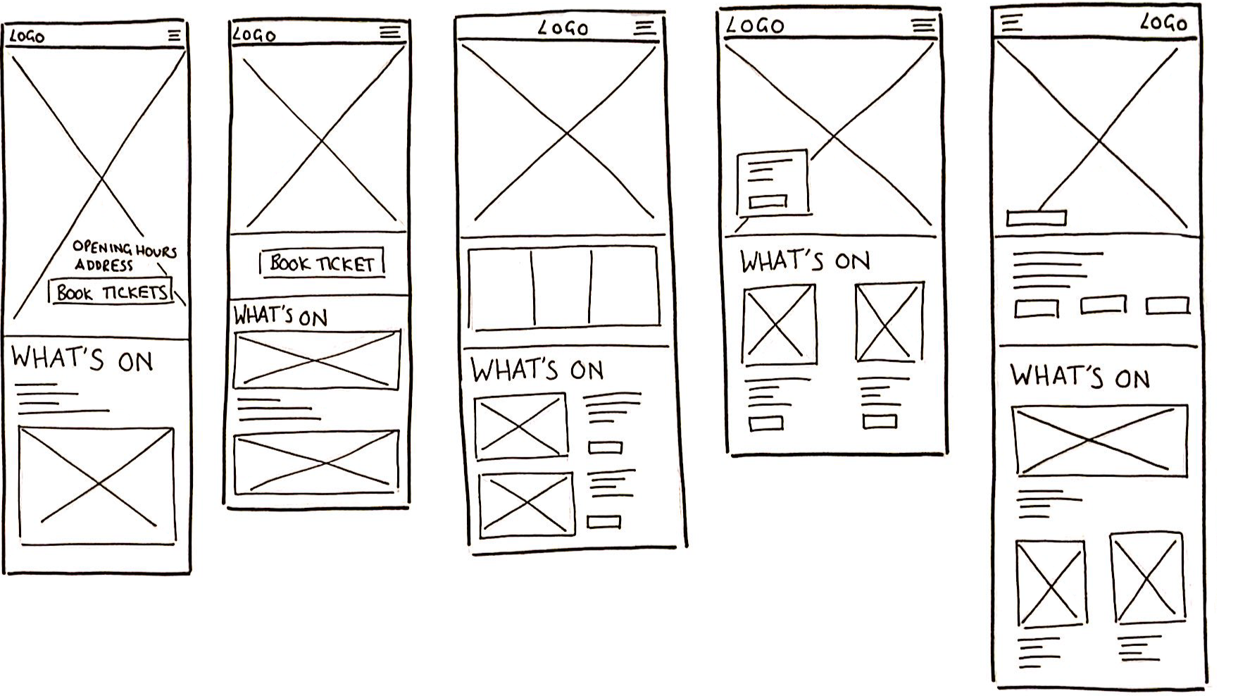
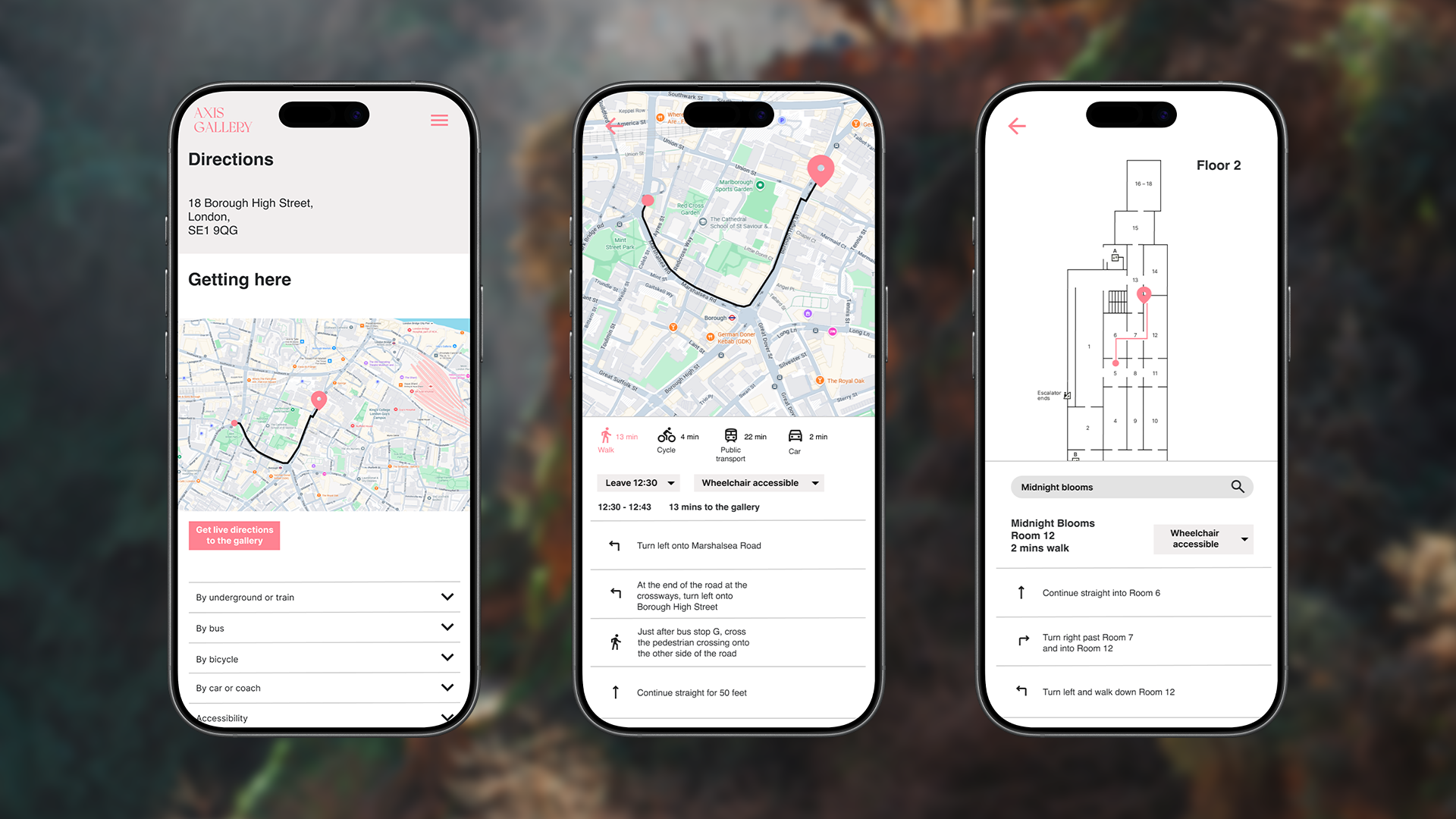
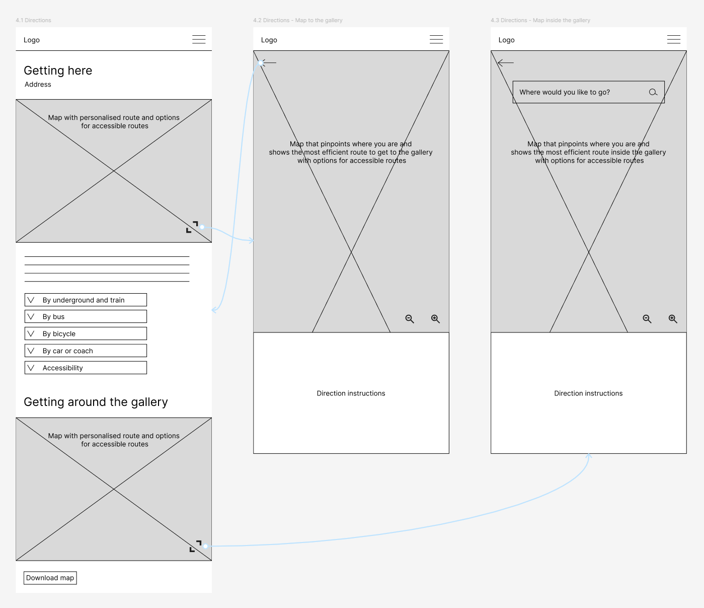
Integrated real-time maps and personalised routes aims to reduce time spent switching between platforms
A real-time map with personalised routes to and around the gallery aims to reduce friction by bringing the entire journey into a single app experience. Supported by user interview insights, this streamlined visit planning and aims to reduce the time spent switching between platforms to find information.
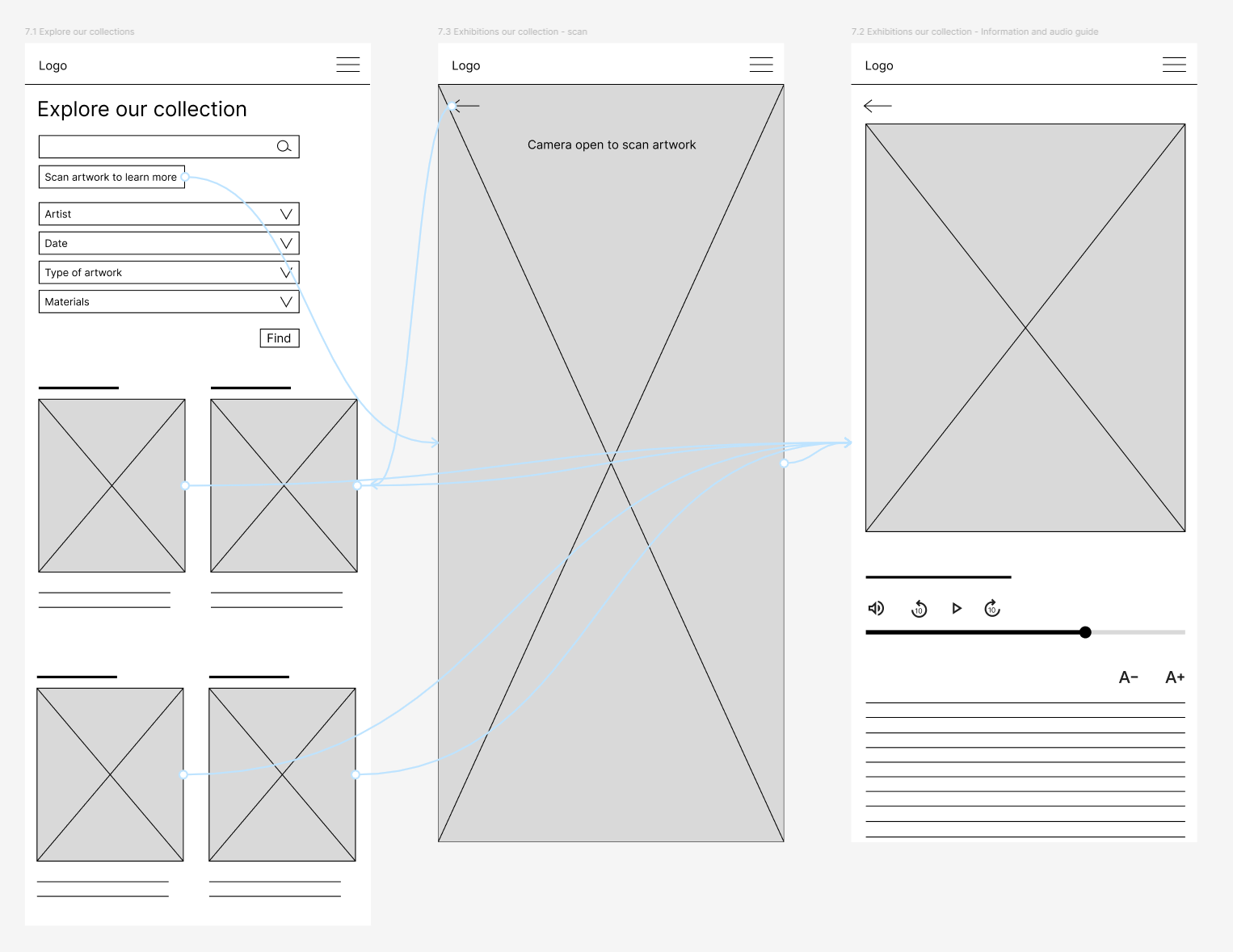
Exploring improved engagement of artwork discovery through scanning, audio guides and adjustable text
Supported by key insights from the user interviews and story map, I explored artwork scanning as an alternative to search and filtering to create a faster and more accessible way to access information. Scanning an artwork provides direct access to digital audio guides and allows users to enlarge text, supporting a wider range of accessibility needs and preferences.
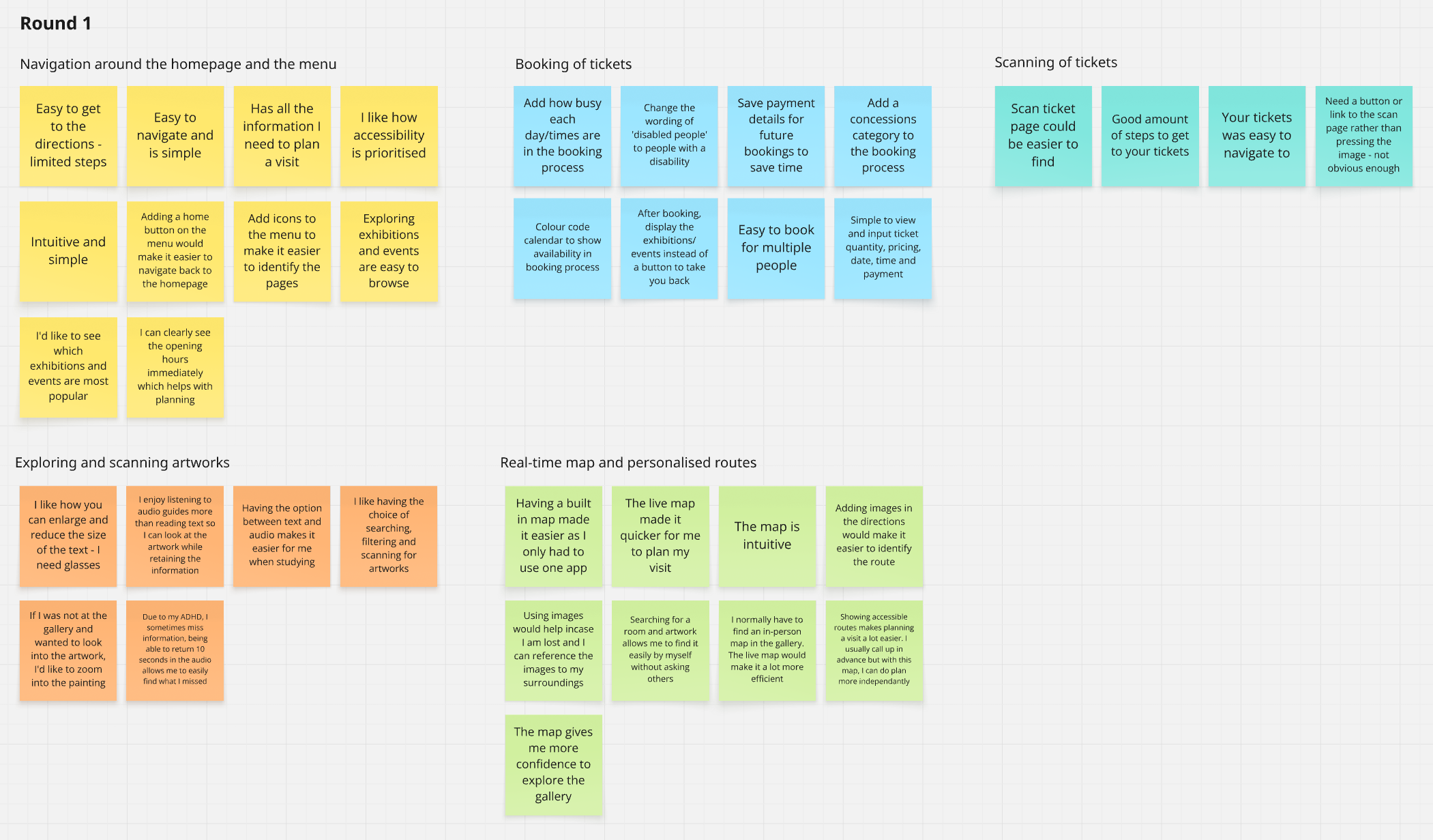
Usability testing evolved from flow validation to immersive in-context interaction
Usability testing was conducted to evaluate the wireframes and flows, emphasising clear information hierarchy, simple navigation, and integrated experiences reduce effort and context switching. A real-time map and personalised routes improved confidence and independence, while accessibility features supported diverse user needs. Improvements were needed in ticket scanning discoverability and booking clarity.
A second round of testing was conducted after the first revealed limited reflection of the immersive gallery experience, focusing on ticket booking, navigation, and in-context artwork scanning.
USABILITY TESTINGPRIMARY TAKEAWAY
Research highlighted the need to improve accessibility and reduce friction: a homepage gallery map shortcut, visit duration estimates for planning, and synchronised text highlighting. Scanning artwork was found to be disruptive to the experience.
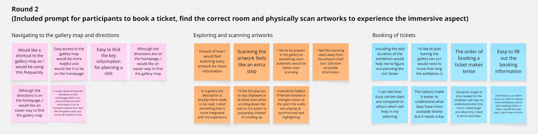
Setback was identified in the usability testing that scanning was seen as a disruption to the experience and caused friction
A setback identified during usability testing was that users saw artwork scanning as an extra step that disrupted their experience of being present with the artwork. Although they wanted access to more information, they preferred it to be integrated seamlessly into their visit.
SETBACKTesting location-triggered content as an alternative to scanning
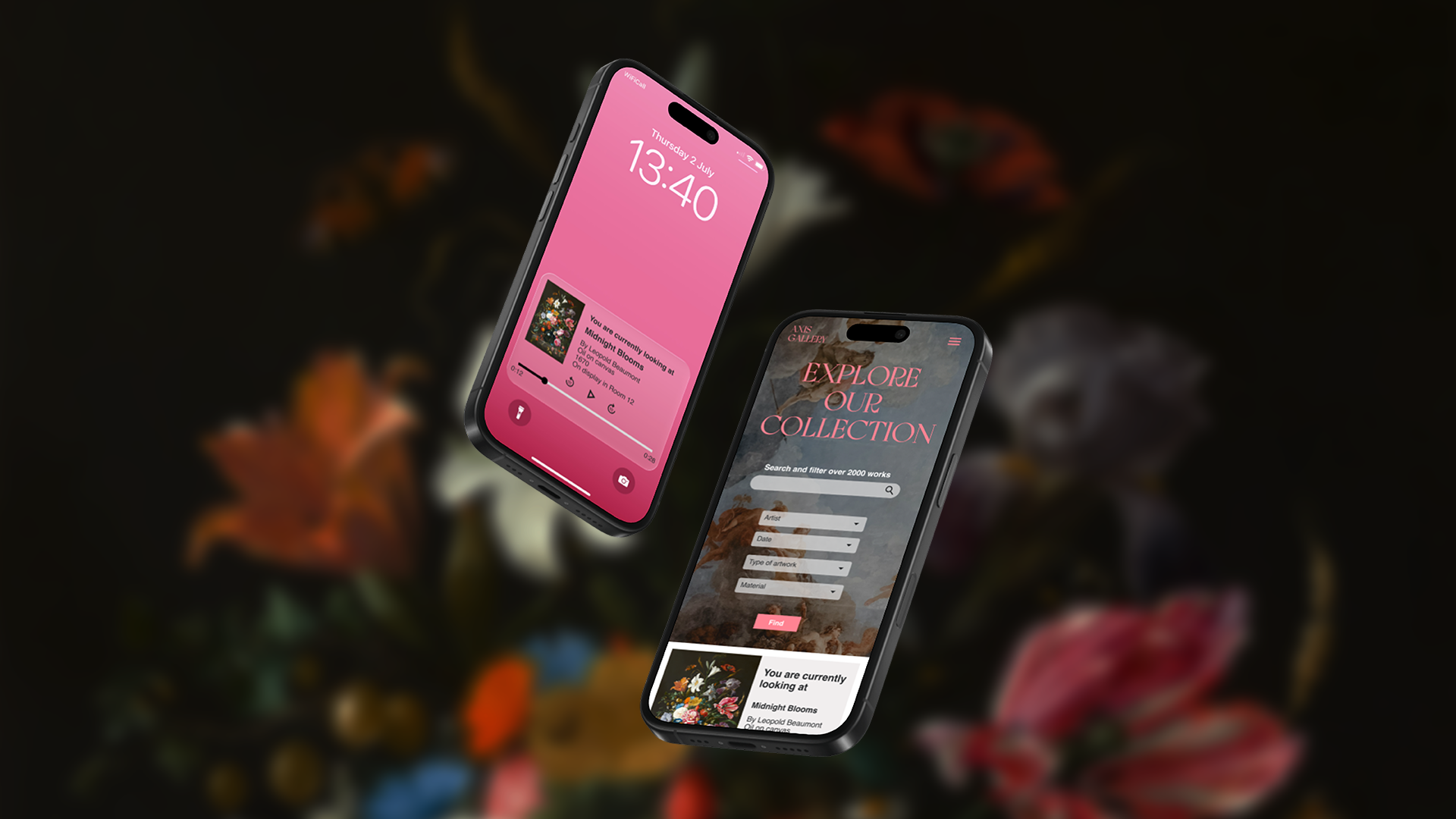
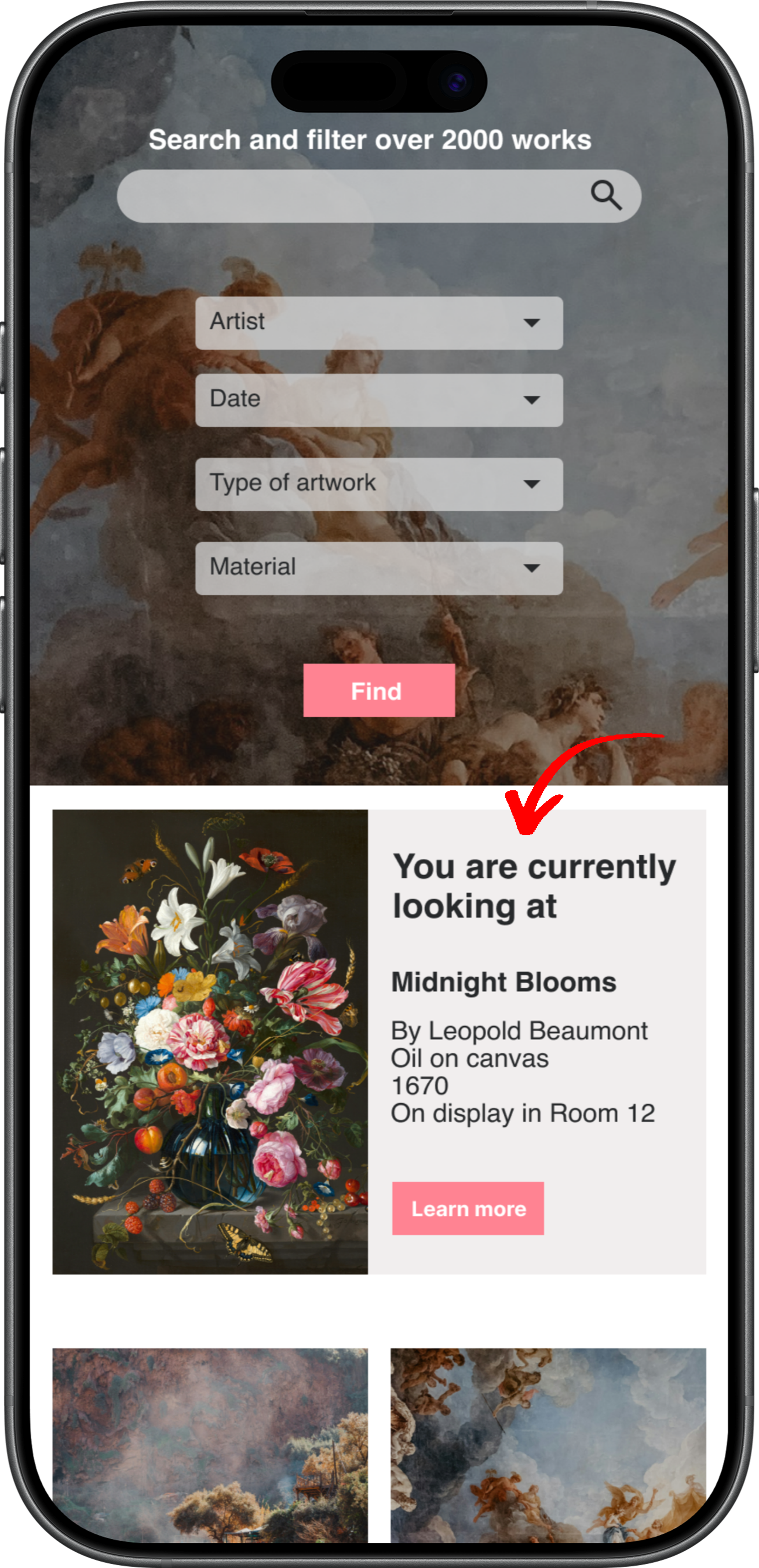
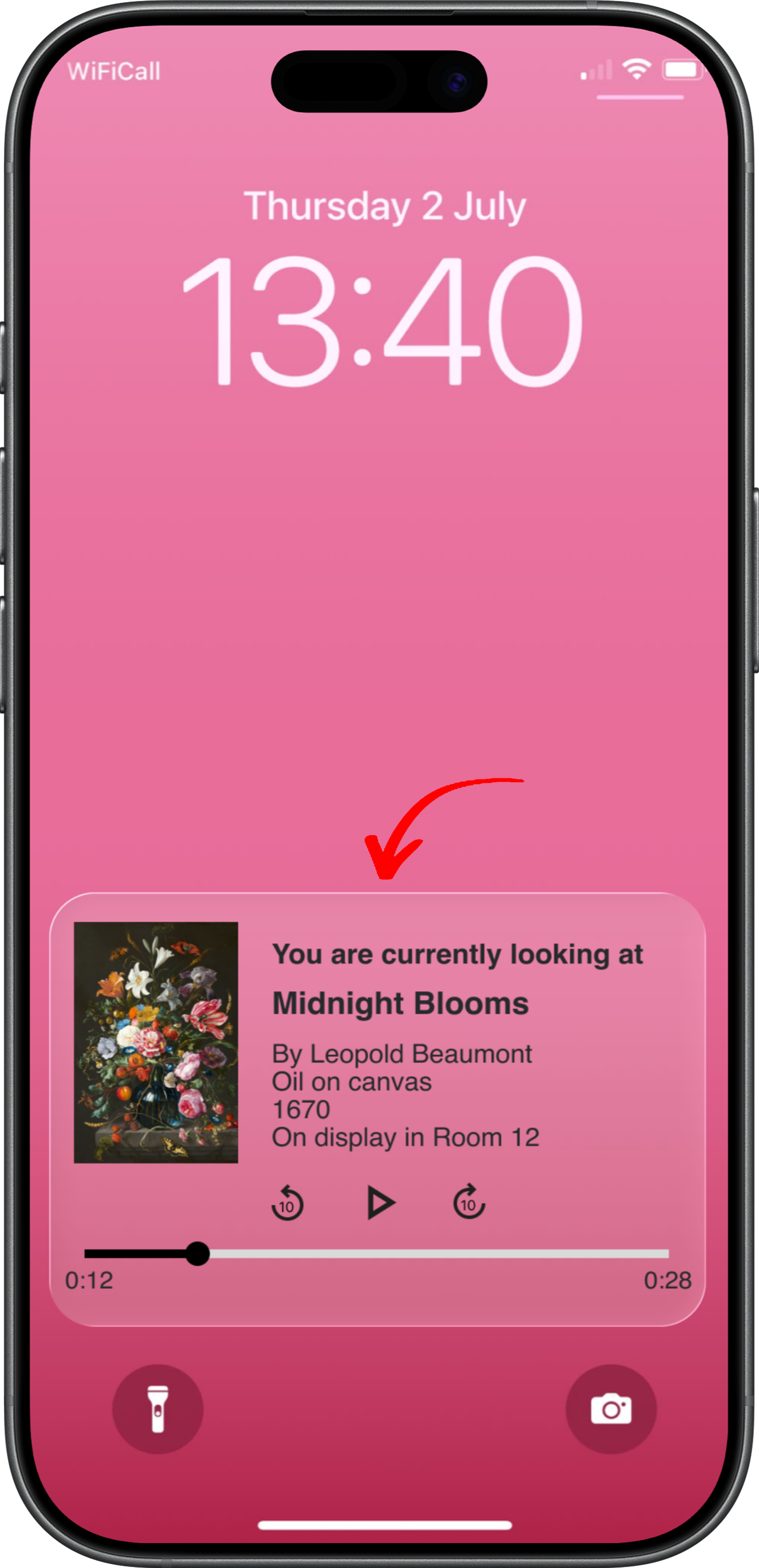
In response to the setback, I explored and A/B tested a location-triggered content experience, where viewing a specific artwork automatically surfaced relevant information and audio guides on the lock screen, home screen, and collections page.
A/B TESTINGPRIMARY TAKEAWAY
A/B testing showed location-triggered content reduced friction and improved accessibility. Users accessed information immediately compared to an average of 14 seconds using the scanning flow.
Control: Scanning
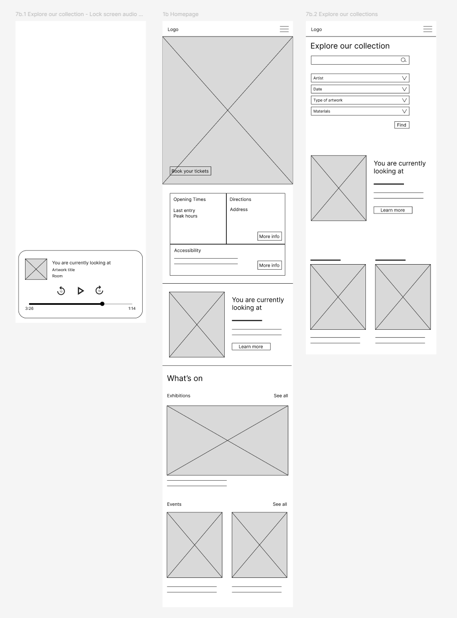
Variant: Location-triggered content
Developing a design system that supports immersion and accessibility while keeping artwork at the centre of the experience
The design system was created to give Axis Gallery a modern and premium visual identity while still feeling approachable and engaging. The use of luxury-inspired aesthetics, clean layouts, and refined typography was influenced by Axis Gallery’s tone of voice, helping the artwork remain the key focus of the experience. Large imagery and minimal layouts were used to create an immersive feel that reflects the atmosphere of visiting a real gallery.
DESIGN SYSTEMGallery map shortcut
Problem
Usability testing showed that users relied on the gallery map to navigate the space but struggled to locate it quickly within the app. Repeatedly searching for the map reduced confidence in navigating the gallery independently.
Solution
A persistent gallery map shortcut was introduced on the homepage, making wayfinding tools immediately accessible. Faster access to the map increased users' confidence, independence, and efficiency when navigating the gallery during their visit.
MAIN REFINEMENTS BASED ON TESTING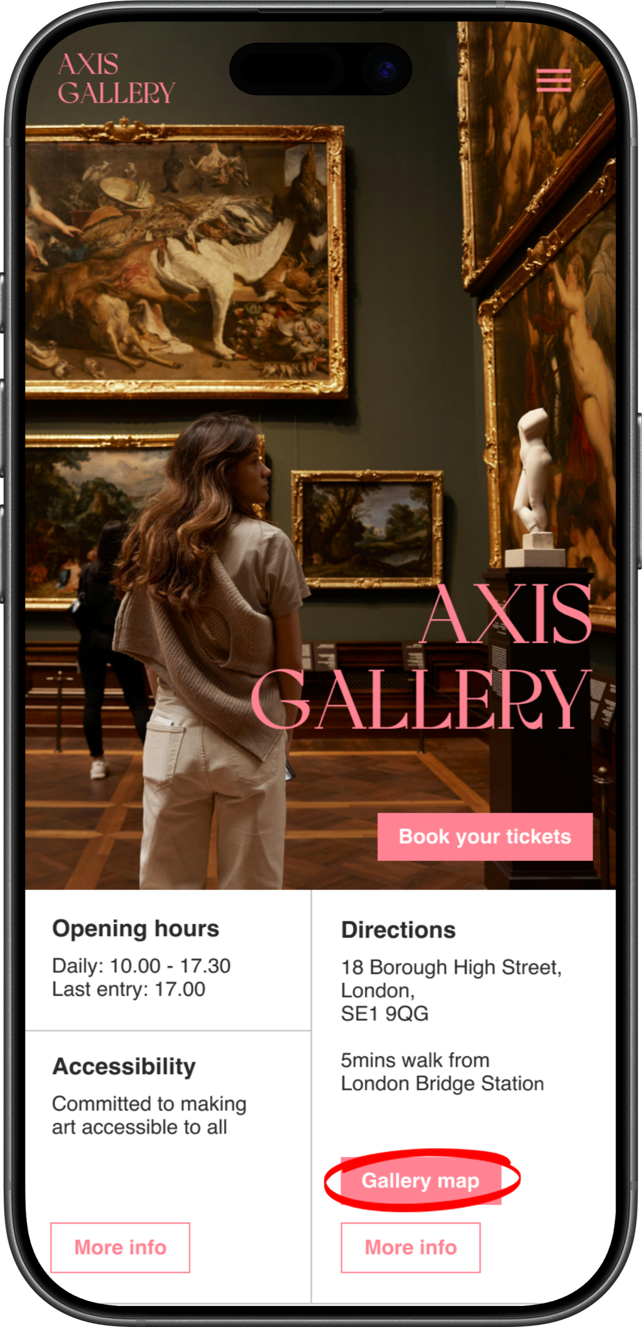
Average visit duration before booking process
Problem
Usability testing revealed that users wanted an indication of average visit duration for exhibitions and events to help them plan their day effectively. Without this information, users found it difficult to estimate how long to allocate for their visit alongside other activities.
Solution
Average visit duration was added directly beneath the “Book your tickets” button to ensure it was visible early in the journey and before users entered the booking flow, enabling faster and more informed decision-making when selecting dates and times.

Location-triggered content and synchronised accessible text
Problem
Usability and A/B testing showed that users wanted a more integrated and accessible way to learn about artworks during their visit. The existing scanning experience felt disruptive and interrupted immersion and the lack of text support reduced accessibility for audio content.
Solution
Location-triggered content was introduced to provide instant access to artwork information based on proximity. The audio guide automatically surfaces on the lock screen, home screen, and ‘Explore Our Collection’ page, reducing friction. Synchronised highlighted text was added alongside the audio to improve accessibility and support different learning needs.

OUTCOMEHomepage
Booking process
Explore our collection
Directions
Reduced friction, increased confidence and improved accessibility
The project reduced friction across the visitor journey by bringing discovery, ticketing, navigation, and learning into a single integrated experience. Real-time navigation and clear wayfinding helped visitors feel more confident exploring unfamiliar spaces independently, while accessibility features such as location-triggered content and synchronised text supported a wider range of needs and learning styles. Together, these improvements created a more seamless, immersive, and inclusive gallery experience that better supported visitors before, during, and after their visit.
OUTCOME + IMPACTKEY TAKEAWAYSDesigning for real-world contexts, putting the curb cut effect into practice and focused scope
This project reinforced the importance of seamless interactions, real-world testing and accessibility. I learnt that features that seem useful in isolation, such as scanning, can become disruptive in context, while inclusive design can benefit everyone. In hindsight, focusing on one aspect of the app would have allowed for deeper exploration and refinement.
NEXT OPPORTUNITIESExpanding map testing and accessibility enhancements and include multi-language features
Future iterations could focus on improving the real-time map experience through more detailed testing to better understand usability in context. There is also an opportunity to introduce multi-language support to make the app more accessible for international visitors and non-English speakers. In addition, further exploration of accessibility enhancements could ensure the experience is more inclusive for a wider range of users such as thinking about sign language and summaries.